The Secret to Mixing Patterns Without Overwhelm in Steps
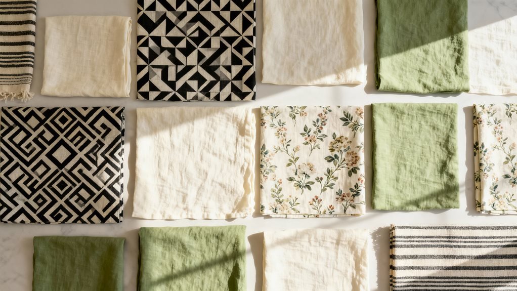
I’ve found the secret to mixing patterns is starting with a unifying color palette of three to five shades, then choosing patterns in three distinct scales—large, medium, and small. I always select one dominant anchor pattern that takes up about 60% of the visual space, then layer in supporting designs while using solid neutrals as breathing room between busier prints. I test combinations with swatches before committing, and I’m never afraid to swap elements until the balance feels just right—there’s so much more to explore about creating this harmony.
Design Highlights
- Establish a unifying palette of three to five colors, selecting one or two dominant hues plus coordinating accent shades.
- Choose an anchor pattern claiming 60% visual space, then layer medium (30%) and small-scale (10%) patterns around it.
- Pair one busy, bold pattern with simpler, quieter designs to create visual breathing room and prevent overwhelming the space.
- Incorporate solid colors and neutral anchors between patterns to ground the design and allow the eye to rest.
- Test combinations using swatches in your actual space, adjusting one pattern at a time until balance feels intentional.
Start With a Unifying Color Palette
The easiest way to mix patterns successfully is to choose three to five colors that will appear throughout your space. I recommend selecting one or two dominant colors, plus a few accent shades. This creates cohesion even when your patterns vary wildly in style.
Here’s what I do: I pull colors from a favorite piece I already own—maybe a patterned rug or artwork. Then I ensure each additional pattern incorporates at least one of those colors. It doesn’t need to match perfectly; similar tones work beautifully.
You’ll notice that when patterns share a color story, they feel intentional rather than chaotic. A floral pillow, geometric throw, and striped curtains can absolutely coexist when they’re speaking the same color language.
Start by laying out your patterned pieces together. If the colors complement each other, you’re on the right track. This simple foundation makes everything else fall into place effortlessly.
Master the Rule of Three Pattern Scales
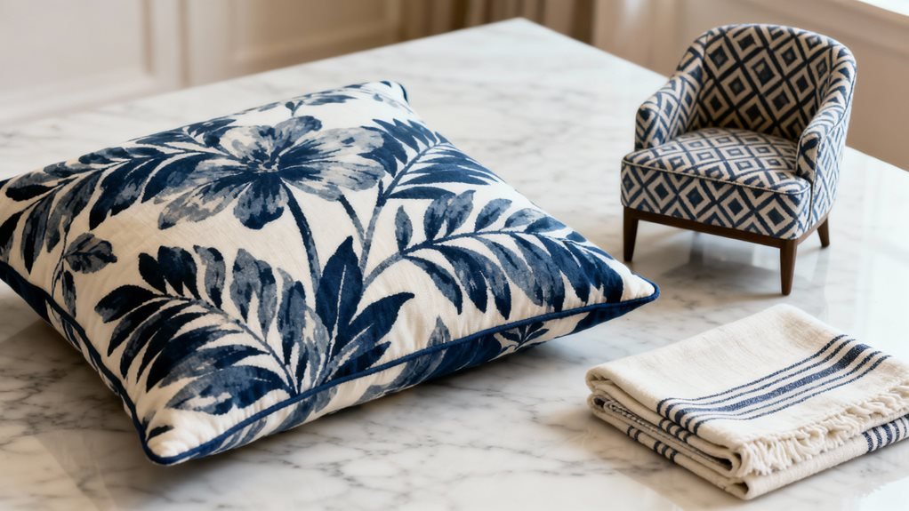
One of my favorite tricks for pattern mixing is varying the scale—and it’s simpler than you might think. I use three distinct pattern sizes in each room: large, medium, and small. This creates visual hierarchy and prevents patterns from competing with each other.
Here’s how I break it down:
| Scale | Pattern Size | Best Used On |
|---|---|---|
| Large | 6+ inches | Curtains, duvets, rugs |
| Medium | 2-6 inches | Throw pillows, chairs |
| Small | Under 2 inches | Accent pillows, artwork |
For example, I’ll pair large-scale floral curtains with medium geometric pillows and small dotted throws. The key is ensuring each pattern has its own space to breathe. When you vary the scale this way, your eye naturally moves around the room without getting stuck or overwhelmed. Start with one large statement pattern, then layer in your medium and small supporting players.
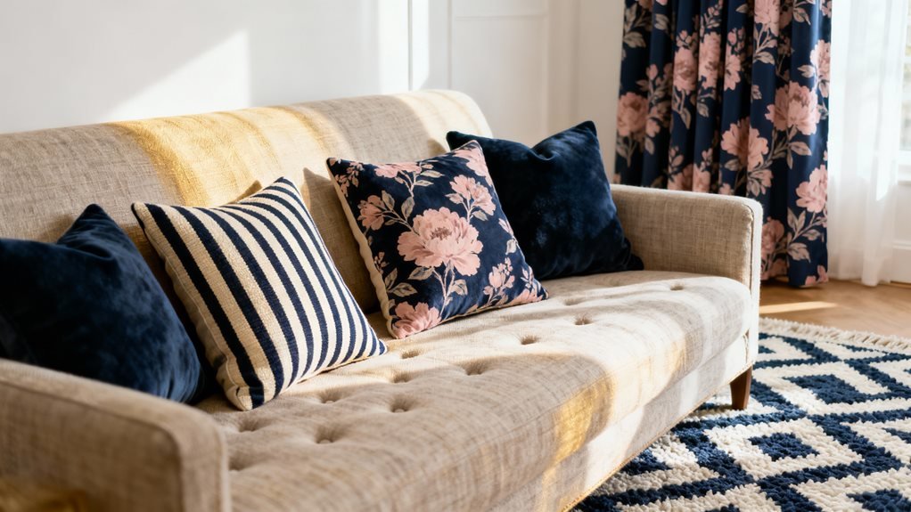
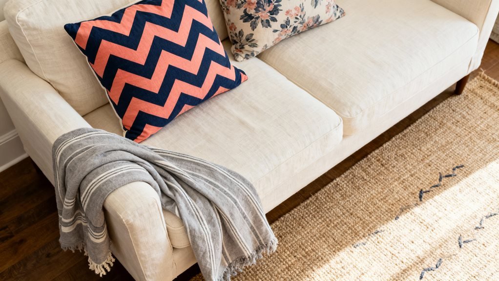
Anchor Your Design With a Dominant Pattern
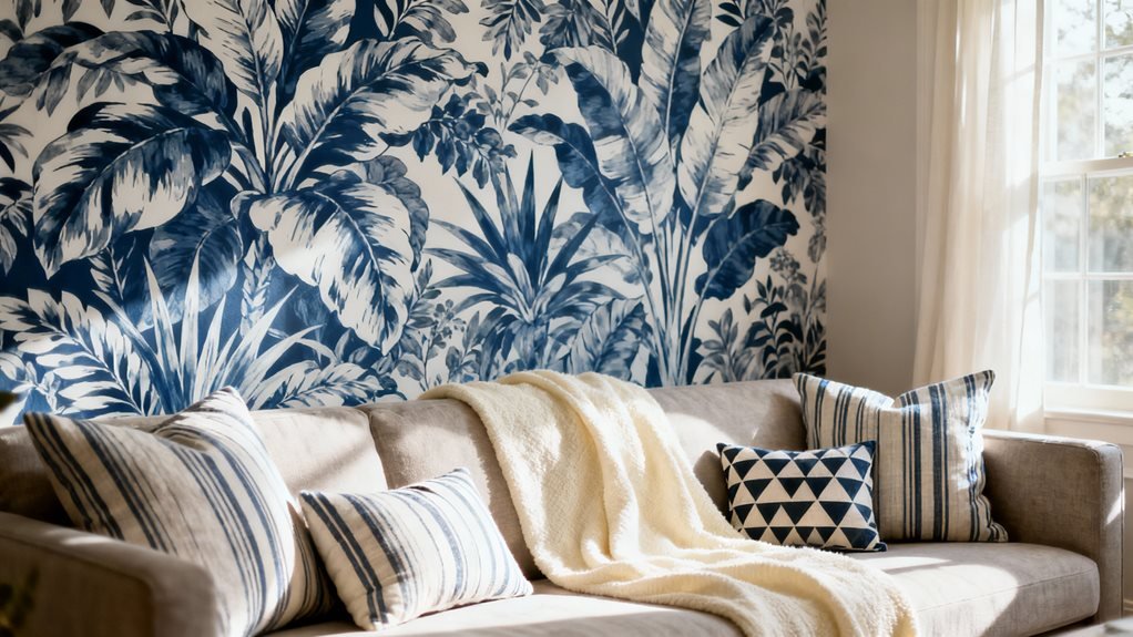
Every successful pattern-mixed room needs a hero—that one dominant pattern that sets the tone and tells the others what to do. I always choose my anchor pattern first, letting it claim the most visual real estate in the space. This might be your curtains, a statement rug, or an upholstered sofa.
Your dominant pattern should reflect the room’s personality. If you’re going bold, pick something with strong contrast and scale. For a softer approach, choose a large-scale floral or geometric with gentler colors.
Once you’ve selected your anchor, pull colors directly from it for your supporting patterns. This creates instant cohesion. I typically let my dominant pattern cover 60% of the pattern distribution in the room, leaving 30% for a medium-scale secondary pattern and 10% for accent patterns.
Think of your anchor as the conductor of an orchestra—it doesn’t play every instrument, but it guides everything else into harmony.
Balance Busy Prints With Simpler Designs
After establishing your anchor pattern, you’ll need breathing room to keep the design from tipping into chaos. I’ve learned that the most successful pattern combinations follow a simple rhythm: one busy, one calm.
Think of it like a conversation. If everyone’s shouting, nobody’s heard. Your dominant pattern already makes a bold statement, so pair it with quieter designs that give the eye a place to rest.
I recommend using small-scale patterns or textures alongside your statement piece. A geometric print works beautifully with subtle stripes. Florals sing when balanced with solid-colored linen or a barely-there dot.
The ratio matters too. I typically aim for 60% dominant pattern, 30% medium-scale design, and 10% simple texture. This creates visual hierarchy without competition.
Use Solids as Visual Breathing Room
Solid colors are your secret weapon when patterns start feeling overwhelming. I’ve found that adding plain fabrics or painted surfaces between patterned pieces gives your eyes a place to rest. Think of solids as the pause between musical notes—they make everything else shine brighter.
When I’m styling a room, I’ll use solid throw pillows alongside patterned ones, or place a solid-colored chair next to a patterned sofa. This creates natural breaks that prevent visual chaos. You don’t need equal amounts of solids and patterns; even small touches work wonders.
Try starting with neutrals like cream, gray, or soft white for your solid pieces. They’re incredibly forgiving and complement almost any pattern combination. If you’re feeling bold, use a solid color that pulls from one of your patterns.
The key is intentionality. Place your solids strategically where you want to create calm, balanced moments in your space.
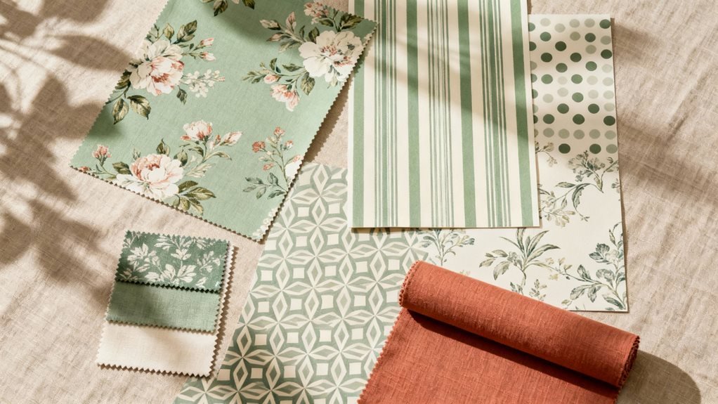
Test Your Combinations Before Committing
How can you be sure your pattern choices will actually work together? I always test combinations before making permanent decisions.
Start by gathering fabric swatches, wallpaper samples, or even photos of patterned items you’re considering. Arrange them together in the actual space where they’ll live. Natural lighting reveals how colors and patterns truly interact throughout the day.
I recommend the “step back” test. Place your samples together, then walk away for a few minutes. Return with fresh eyes—you’ll immediately sense whether the combination feels harmonious or chaotic.
Take photos with your phone. The camera often exposes clashing elements your eye might miss in person. Review these images away from the space to gain objective perspective.
If something feels off, swap one pattern at a time until you achieve balance. This methodical approach prevents costly mistakes and builds your confidence. You’ll know when you’ve found the right mix—it’ll simply feel right.
Trust Your Eye and Adjust as Needed
After you’ve tested your pattern combinations, I encourage you to physically step back from the space—yes, literally move several feet away. From this distance, you’ll notice how the patterns interact as a whole rather than as individual pieces competing for attention. If something feels off, trust that instinct and rearrange elements until the room achieves the balanced, cohesive look you’re after.
Step Back, Assess Overall
Sometimes the magic happens when you literally take three steps backward and let your eyes do the talking. I’ve found that physical distance gives you a fresh perspective on whether your patterns are singing together or shouting at each other.
Here’s what I look for:
| What to Check | Good Sign | Red Flag |
|---|---|---|
| Eye movement | Flows naturally around the room | Gets stuck in one spot |
| Energy level | Balanced and inviting | Chaotic or overwhelming |
| Color distribution | Evenly spread throughout | Clumped in one area |
| Pattern dominance | One clear star, others support | Everything competing equally |
| Overall feeling | Cohesive and intentional | Random and disconnected |
Take a photo on your phone—it reveals what your brain might be overlooking. Trust what you see from that distance.
Rearrange Until It Feels Right
What if I told you that perfect pattern mixing doesn’t exist on the first try? It’s all about rearranging until something clicks. I move pillows between rooms, swap throws, and shift artwork constantly. This isn’t indecision—it’s refinement.
Trust what your eye tells you. If something feels off, it probably is. Don’t overthink it; just adjust.
Here’s my rearranging process:
- Move one element at a time – Swap a single pillow or piece rather than redoing everything
- Step away for an hour – Fresh eyes reveal what’s working and what isn’t
- Take photos from different angles – Your camera catches imbalances you might miss
- Live with it temporarily – Sometimes patterns grow on you after a few days
Keep tweaking until the space feels balanced and intentional.
Frequently Asked Questions
What Are the Best Patterns for Small Spaces Versus Large Rooms?
I’ve seen massive florals completely swallow tiny rooms whole! For small spaces, I recommend you stick with smaller-scale patterns like mini geometrics, delicate stripes, or petite prints. They’ll make your room feel open and airy. In large rooms, you’ve got freedom to go bold with oversized florals, dramatic damasks, or chunky plaids. These bigger patterns won’t get lost in expansive spaces. Just remember, you’re creating visual balance, not chaos!
How Do I Mix Patterns Across Different Rooms While Maintaining Flow?
I create flow between rooms by choosing one consistent element—like a color palette or pattern scale—that threads through each space. For example, if I’m using bold geometrics in my living room, I’ll echo those colors in a softer floral print in the adjacent dining room. I also keep my hallways relatively neutral so they act as visual “breathers” between patterned spaces. This way, each room feels distinct yet connected.
Can I Mix Patterns From Different Design Styles Like Modern and Traditional?
I love mixing modern and traditional patterns—it creates such rich, layered spaces. The key is finding a common thread to unite them. Try matching color palettes, keeping similar scale between patterns, or using the same material (like both being textiles or wallpapers). For example, pair a geometric modern print with a classic floral if they share the same navy blue. This contrast actually makes rooms feel more collected and personal than matchy-matchy.
What’s the Difference Between Mixing Patterns in Decor Versus Fashion Styling?
The main difference is permanence and scale. In fashion, you’re mixing patterns on a single moving canvas—your body—where everything shifts with you. I can experiment freely because I’ll change tomorrow! In decor, patterns stay put and interact with lighting, furniture, and architecture long-term. You’ll live with those choices daily, so I need to be more strategic about placement, scale variation, and ensuring patterns complement the room’s fixed elements rather than competing.
How Often Should I Update or Rotate Patterned Pieces in My Space?
I’d suggest refreshing your patterned pieces seasonally—about every three to four months. This keeps your space feeling current without overwhelming your budget or energy. You don’t need to replace everything; simply swap out smaller items like throw pillows, blankets, or artwork. I’ve found that rotating patterns with the seasons creates natural variety while maintaining your core design. If you’re loving your current mix, though, there’s absolutely no pressure to change anything until you’re ready for something new.