3 Eclectic Color Palettes That Feel Effortlessly Warm
I’ve found three color palettes that never fail to make a room feel warm and inviting: burnt terracotta paired with dusty sage for that Mediterranean embrace, golden mustard with deep plum for jewel-toned comfort, and rust orange with slate blue for unexpected depth. The secret is balancing warm accents with cooler or neutral tones, letting each color breathe without overwhelming the space. I’ll walk you through exactly how to layer these combinations using textiles, accent walls, and natural light to create that effortlessly cozy atmosphere.
Design Highlights
- Terracotta and dusty sage create a Mediterranean vibe, balancing sage dominance with terracotta accents and creamy neutrals for harmony.
- Golden mustard and deep plum deliver jewel-toned warmth, with brass accents amplifying colors and contrast preventing overwhelm.
- Rust orange and slate blue pair earthy warmth with cool sophistication, using textiles and natural wood for depth.
- Balance warm accents with cooler neutrals; creamy bases unify palettes while metals like brass tie elements together.
- Layer colors through textiles and accent walls; natural light enhances warmth, creating collected, intentional spaces.
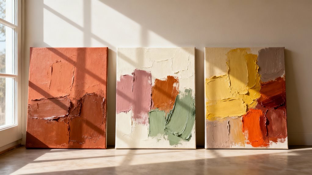
Burnt Terracotta and Dusty Sage: The Earthy Embrace
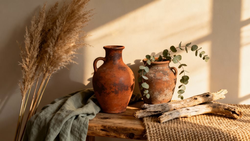
I’ve since added terracotta throw pillows and a dusty sage linen sofa, and the combination feels like bringing the Mediterranean countryside indoors. The secret is balance—I use sage as my dominant color (about 60%) and terracotta as punchy accents (maybe 30%), then fill the remaining space with creamy neutrals.
This palette works especially well in spaces with natural light. Morning sun makes the terracotta glow, while evening light softens everything into this cozy, earthy embrace that feels both collected and intentional.
Golden Mustard and Deep Plum: Rich Jewel-Toned Comfort
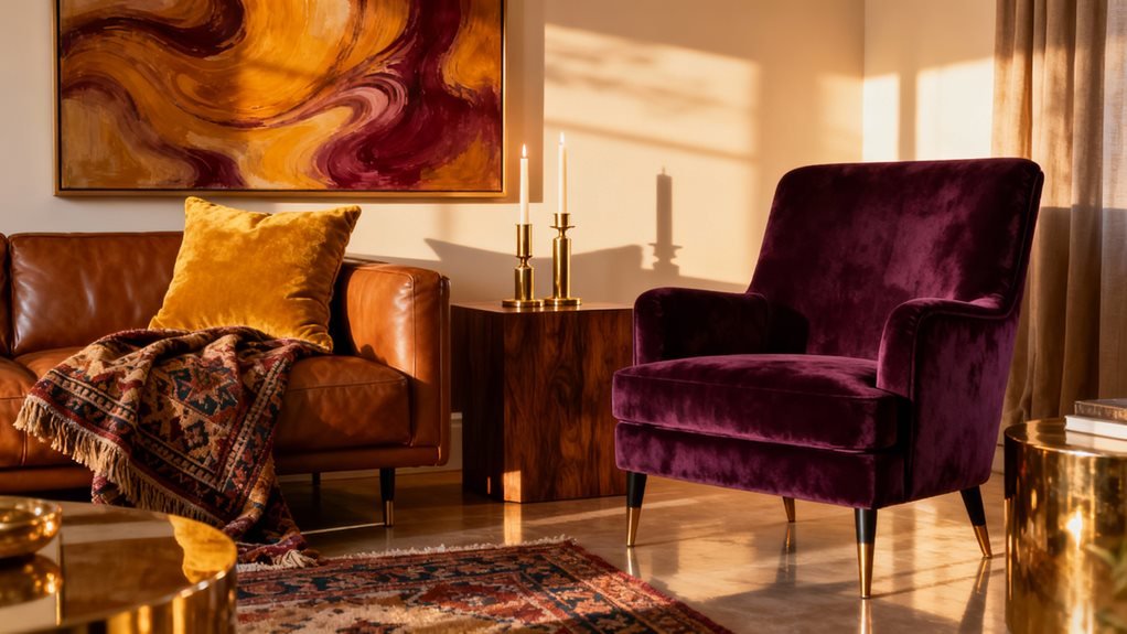
When did I become someone who pairs mustard with plum? Honestly, it happened by accident. I found this vintage mustard velvet chair at an estate sale, brought it home, and realized it looked stunning against my plum accent wall. That happy mistake taught me something valuable about warm color palettes.
These jewel tones create depth without feeling heavy. The golden mustard brings sunshine and optimism, while deep plum adds sophistication and grounding weight. Together, they feel like a cozy autumn evening—rich, inviting, and completely unintentional in the best way.
I’ve layered this combo throughout my living room: mustard throw pillows on a neutral sofa, plum curtains framing the windows, and brass accents tying everything together. The metallic touches amplify both colors beautifully.
What makes this palette work is contrast. The warm, bright mustard prevents plum from feeling too moody, while plum keeps mustard from overwhelming the space.
Rust Orange and Slate Blue: The Unexpected Warmth of Cool Contrast
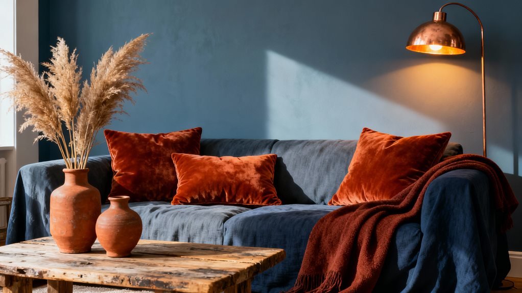
Why does rust orange feel warm even when paired with a cool color like slate blue? I’ve discovered it’s because rust carries such strong earthy undertones that it actually warms up cooler hues rather than clashing with them.
I used this combination in my guest bedroom last fall, painting one wall slate blue and adding rust-colored throw pillows and a vintage terracotta vase. The contrast created this sophisticated depth I hadn’t expected. The slate blue didn’t feel cold at all—instead, it made the rust glow even richer.
What makes this palette work is the balance. Rust brings fire and energy, while slate blue adds calm sophistication. Together, they create tension in the best way possible.
Try incorporating rust through textiles like curtains or area rugs, then anchor with slate blue walls or furniture. Add natural wood tones and cream accents to soften the transition between these contrasting colors.
Frequently Asked Questions
How Do I Incorporate Warm Color Palettes in a Minimalist Home?
I’d suggest starting with a warm terracotta throw pillow—honestly, it’s like adding a medieval tapestry’s coziness without the castle! I’ve found that keeping my walls neutral lets me play with burnt orange or clay-colored accents through a single vase or blanket. The trick I’ve learned is choosing just two or three warm tones and repeating them sparingly. It’s amazing how a honey-toned wooden bowl can transform a stark white shelf into something inviting.
What Lighting Works Best to Enhance Warm Eclectic Color Schemes?
I’ve found that warm-toned LED bulbs (2700K-3000K) work magic with eclectic schemes. I layer my lighting with brass or copper fixtures that reflect those rich hues beautifully. In my living room, I use dimmable table lamps alongside vintage sconces—it creates depth and lets colors shift throughout the day. I’ll also place an amber-shaded floor lamp in darker corners. Trust me, avoiding harsh overhead fluorescents makes all the difference in keeping that cozy, collected vibe alive.
Can Warm Color Palettes Work in Small Spaces Without Overwhelming Them?
I’ve used warm palettes in tiny apartments with gorgeous results. The trick is balancing rich terracotta or mustard with plenty of breathing room—think one statement wall rather than four. I’ll add warm neutrals like cream or soft taupe to keep things from feeling cramped. Strategic mirrors amplify the coziness without the claustrophobia. In my last rental, burnt orange accents against ivory walls made my shoebox bedroom feel like a welcoming retreat, not a cave.
How Do I Transition Between Warm Color Palettes in Different Rooms?
I create smooth transitions by using a “bridge color” that appears in adjacent rooms. For example, if my living room features terracotta and my hallway leans into golden yellows, I’ll add terracotta accents in the hallway too. I also keep one consistent neutral throughout—like warm white trim or natural wood floors. This way, each room feels distinct but connected, and the flow between spaces feels intentional rather than jarring.
What Textures Complement Warm Eclectic Color Combinations Most Effectively?
I’ve found that layering natural textures works beautifully with warm eclectic palettes. Think chunky knit throws, worn leather chairs, and rough-hewn wood pieces—they all amplify those cozy tones. I’m obsessed with mixing jute rugs with velvet pillows; the contrast feels intentional yet relaxed. Don’t forget weathered metals and raw linen, either. In my living room, I paired terracotta walls with a nubby bouclé sofa, and honestly, it’s transformed the entire vibe into something genuinely inviting.