Category Boho & Eclectic Vibes

cozy boho living room textures

How to Layer Textures for a Cozy Boho Living Room in 7 Steps

I start with a chunky jute rug as my foundation, then layer textiles on my sofa—think knit throws and mixed-texture pillows. Next, I hang woven wall art above the couch for depth, add macramé plant holders at varying heights, and balance hard surfaces like stone with soft velvet cushions nearby. I create dimension by layering pillows from large to small, then finish with organic touches like driftwood and pampas grass. Mastering this seven-step approach completely transformed how inviting my space feels.

Design Highlights

  • Start with a natural fiber rug like jute or sisal to anchor the room with texture and warmth.
  • Layer chunky knit throws and mixed-texture cushions on seating to transform hard surfaces into cozy nooks.
  • Add woven wall hangings above furniture, spanning two-thirds its width, to create depth and visual interest.
  • Balance hard elements like metal frames or stone accents with soft textiles using a 60-40 ratio.
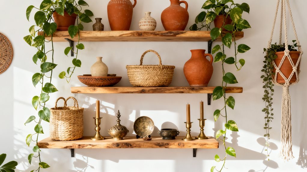
  • Finish with organic elements like dried pampas grass, raw wood tables, and woven baskets for earthy warmth.

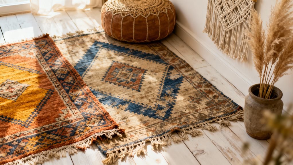
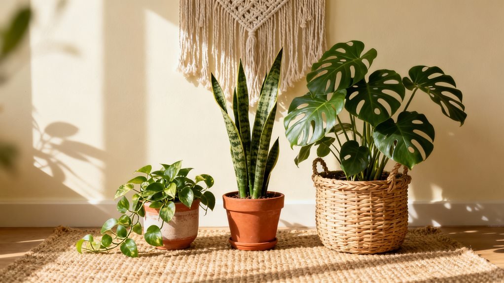
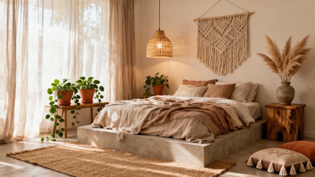
Start With a Foundation of Natural Fiber Rugs

natural fiber rug grounding warm texture

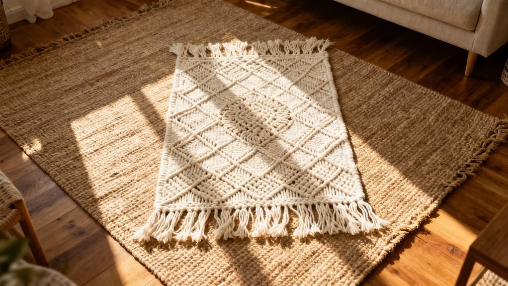
Why do I always start my boho living room designs from the ground up? Because natural fiber rugs create the perfect textural anchor for everything else you’ll layer on top.

I learned this after making the mistake of choosing my rug last. Everything felt disconnected and chaotic. Now, I begin with jute, sisal, or seagrass rugs that bring organic warmth to the space.

Here’s what works: Pick a rug that’s slightly larger than you think you need. Your furniture should sit at least partially on it. I’m obsessed with chunky jute rugs because they add dimension without overwhelming your design.

Pro tip: Don’t worry about stains. These rugs are forgiving and actually look better with age. I spilled coffee on mine last month, and honestly, you can’t even tell.

The texture and neutral tones create a canvas that makes your colorful throws and patterned pillows pop later.

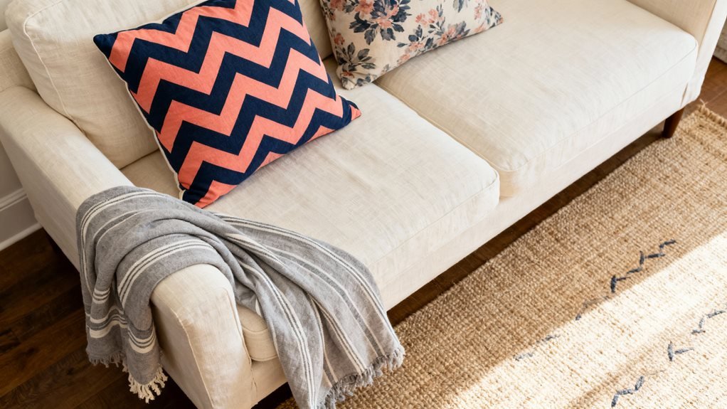
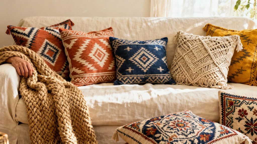
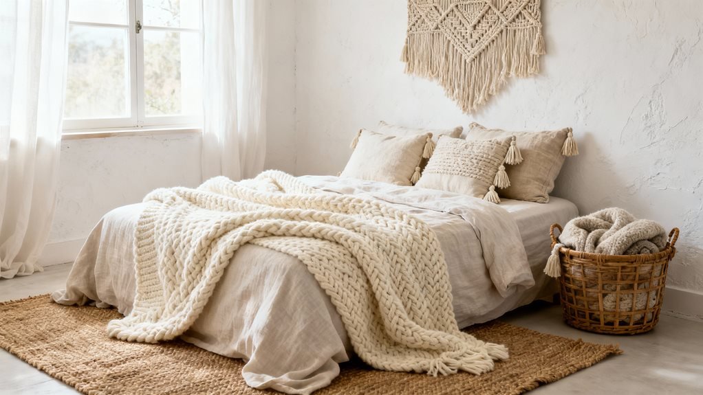
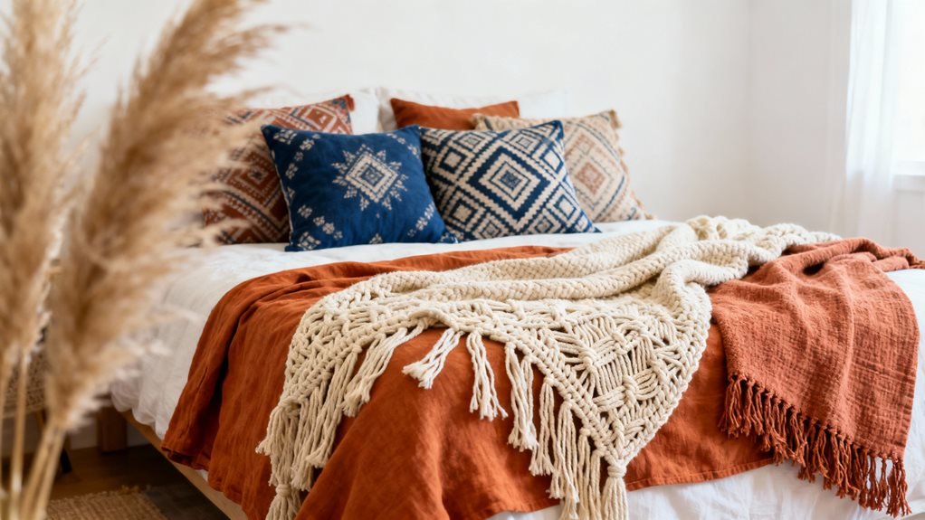
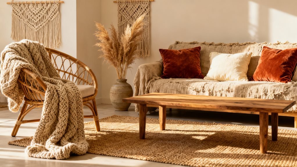
Build Comfort Through Layered Textiles on Seating

layered textiles for inviting seating

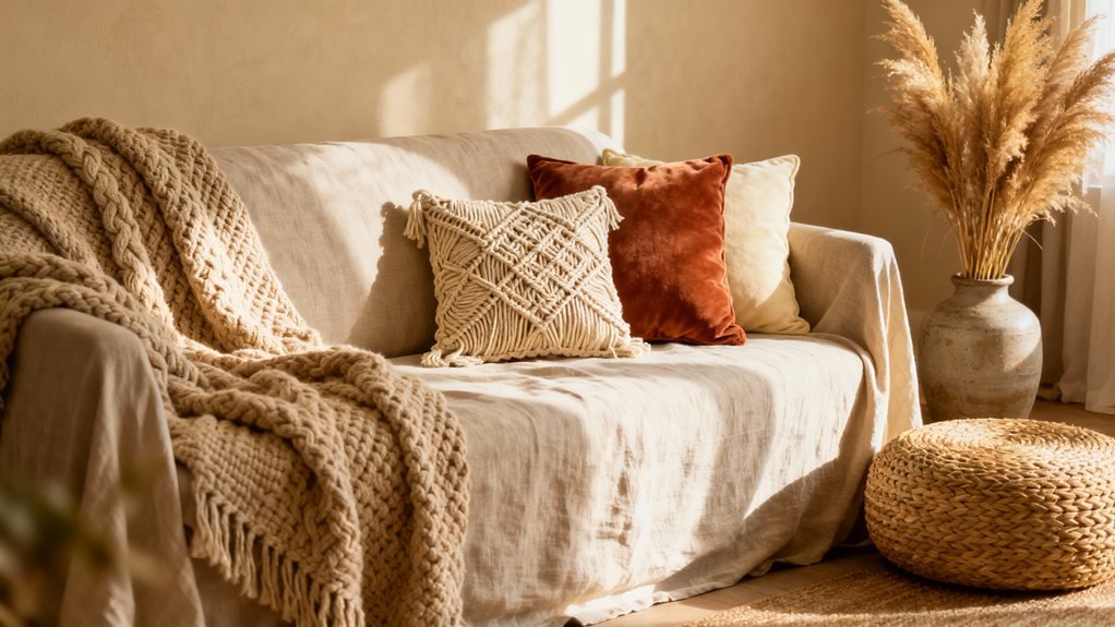
How many times have I walked into a living room that looked beautiful but felt completely uninviting to actually sit in? That’s why I always layer textiles on my seating first—it transforms hard surfaces into cozy nooks.

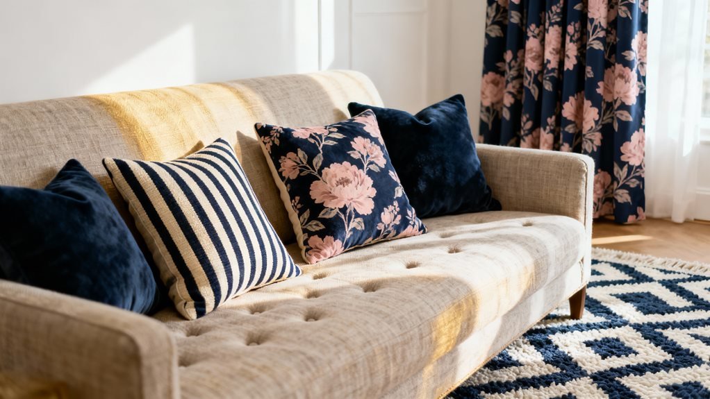
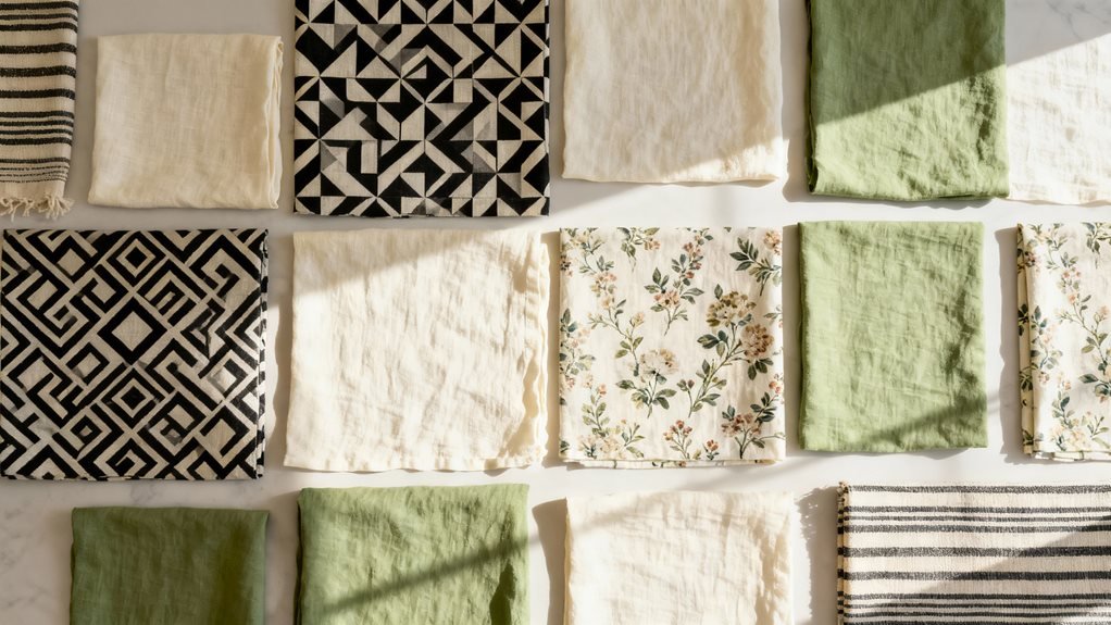
I start by draping a chunky knit throw over the sofa arm. Then I add linen or cotton cushion covers in varying sizes—usually three to five pillows per seating area. I mix textures: a nubby boucle pillow next to smooth velvet, then a macramé or fringed option for visual interest.

Don’t match everything perfectly. I’ve learned that slightly mismatched patterns and textures create that effortless boho vibe. Try pairing geometric prints with organic shapes, or solid textured pieces with subtle patterns.

The key is making seating look so inviting that guests immediately want to curl up. When someone reaches for your throw blanket without asking, you’ve nailed it.

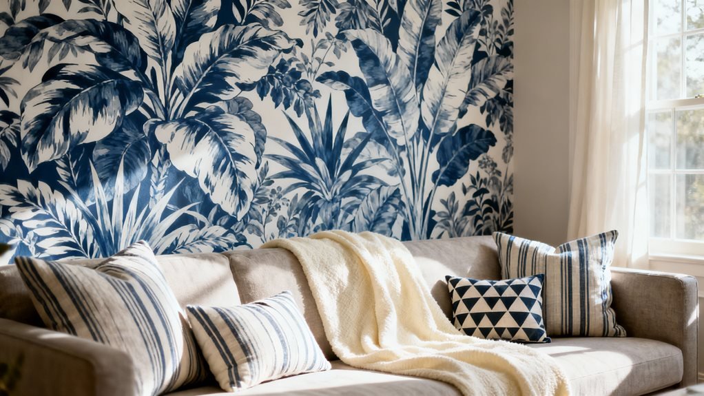
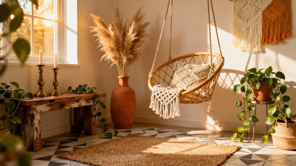
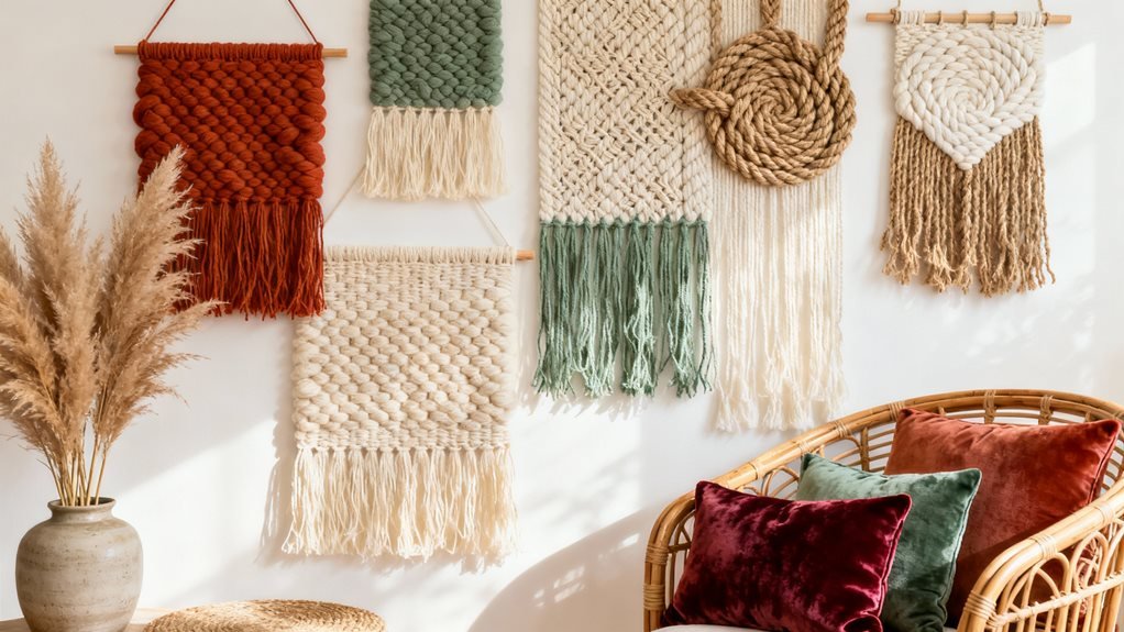
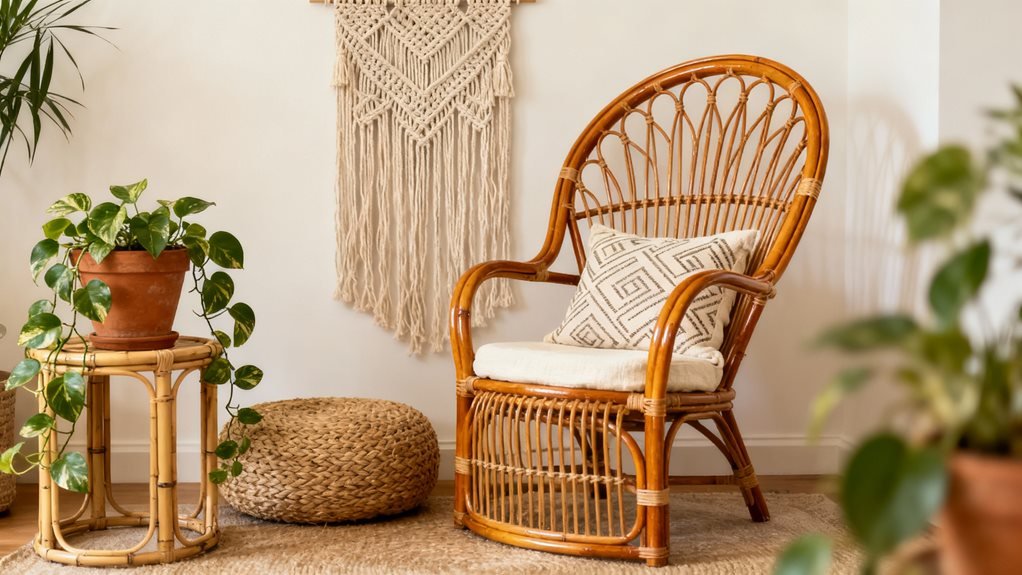
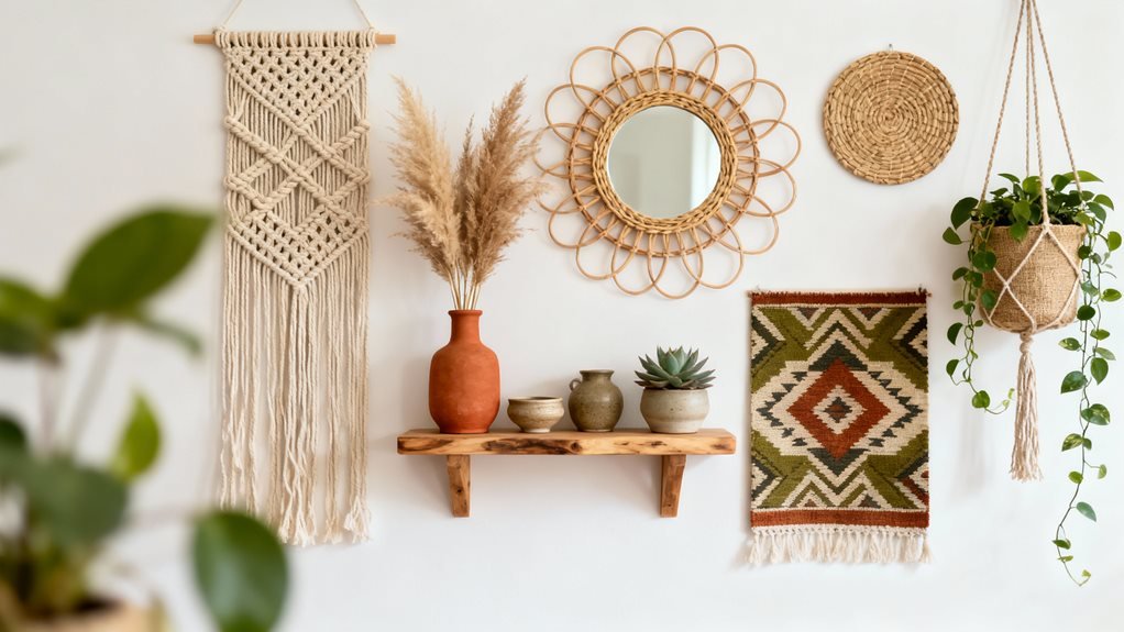
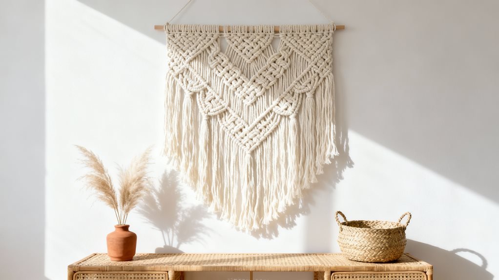
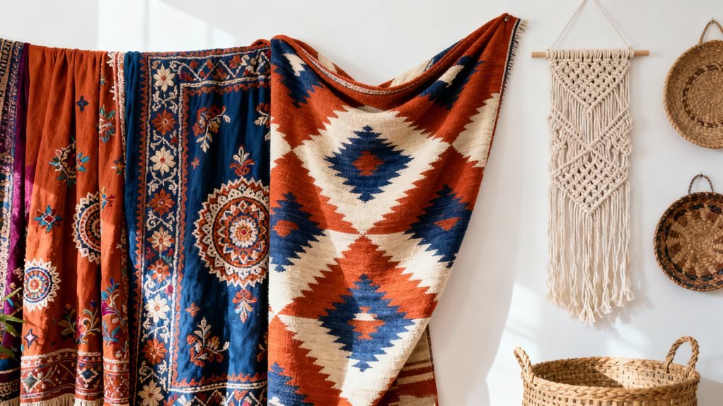
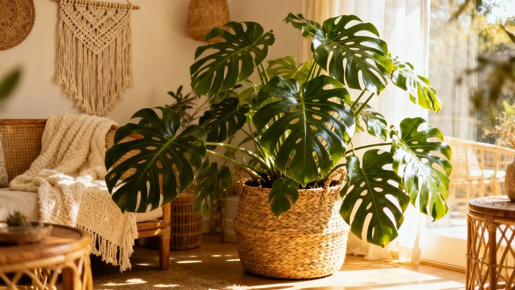
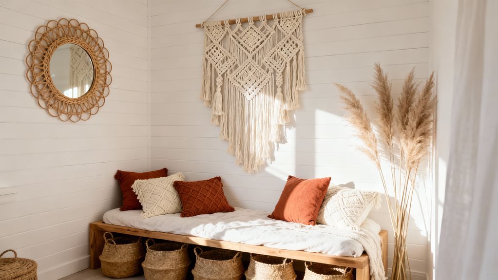
Add Dimensional Interest With Woven Wall Hangings

woven wall hangings add depth

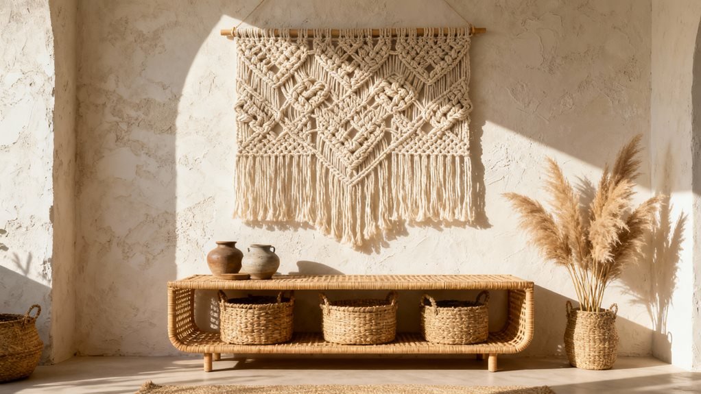
When I hung my first macramé piece above the sofa, I finally understood what my living room was missing—actual depth on the walls. Flat art has its place, but woven hangings cast shadows and create movement that paintings can’t replicate.

I’ve learned size matters tremendously. A small piece on a large wall disappears, so I aim for hangings that span at least two-thirds of my furniture’s width. My favorite spot is above the couch, where the texture creates a focal point that draws eyes upward.

Mix different weaving styles for visual interest. I pair tight macramé knots with loose, shaggy pieces. Natural fibers like jute and cotton work best—they photograph beautifully and age gracefully.

Don’t limit yourself to one. I’ve created a gallery wall combining three smaller weavings with dried pampas grass. The varied textures bounce light differently throughout the day, keeping my space dynamic.

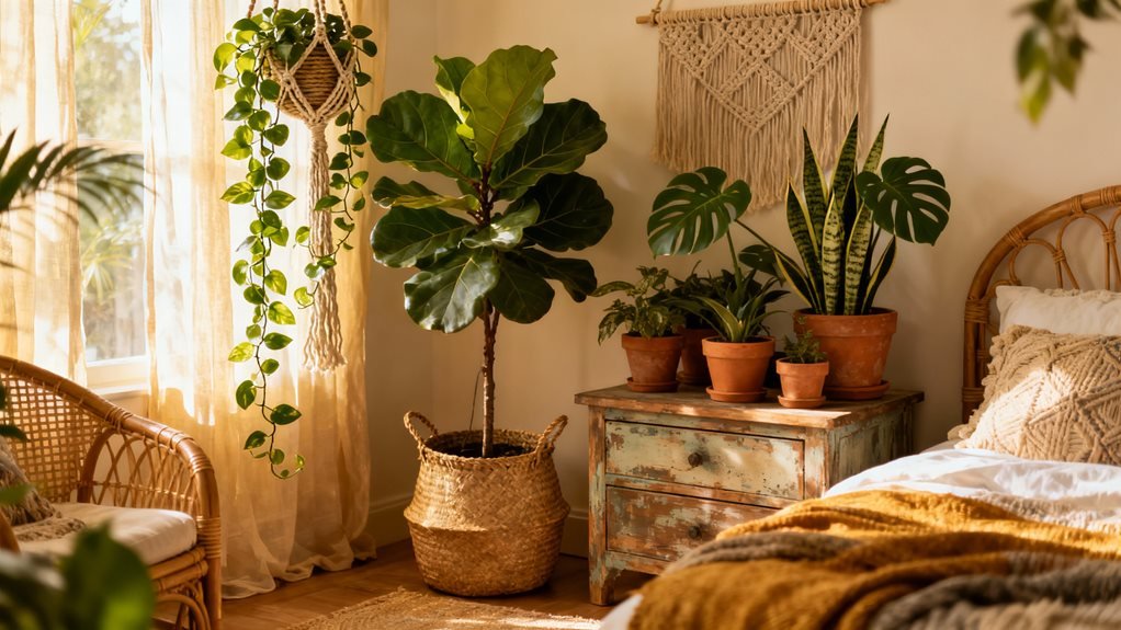
Incorporate Macramé and Knotted Accents Throughout

macram accents everywhere thoughtfully

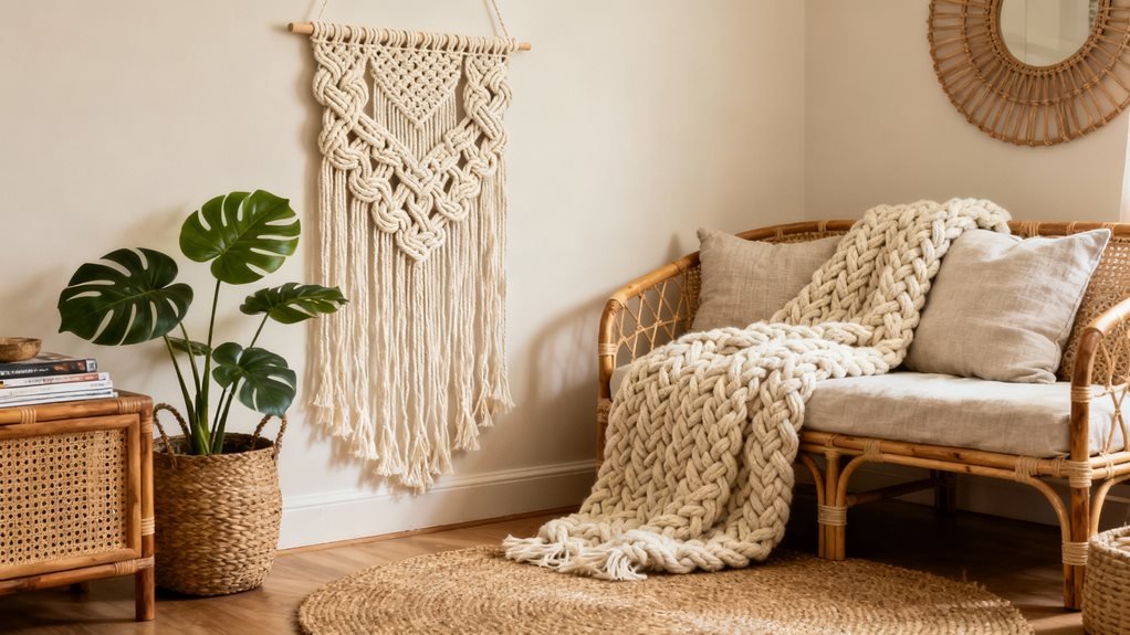
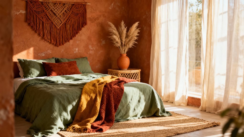
I’ve scattered macramé pieces throughout my living room, and I’ve learned that strategic placement makes all the difference—a large wall hanging behind the sofa creates a stunning focal point, while smaller knotted accents on side tables and shelves tie the whole look together. My favorite trick is hanging macramé plant holders at varying heights near windows, which adds vertical interest and makes the space feel fuller without cluttering surfaces. When mixing different knotted textures, I stick to a consistent color palette (usually neutrals with one accent shade) so the intricate patterns shine without overwhelming the room.

Wall Hanging Placement Ideas

Above your sofa or bed, a large macramé wall hanging becomes an instant focal point that anchors the entire boho vibe of your space. I’ve found that positioning it slightly off-center creates visual interest without looking cluttered.

For smaller pieces, I cluster three knotted hangings at varying heights near doorways or windows. This creates depth and draws the eye naturally through the room.

Don’t overlook awkward corners—they’re perfect spots for cascading macramé planters that add vertical texture. I’ve also hung woven pieces above console tables and floating shelves to connect different zones.

Here’s my trick: step back frequently while positioning. What looks centered up close often needs adjustment from seating areas where you’ll actually view it daily.

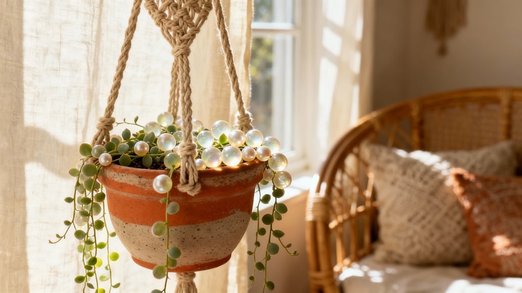
Macramé Plant Hanger Styling

Macramé plant hangers transform greenery into floating sculptures that add dimension without eating up precious floor space. I’ve hung three different lengths in my corner reading nook, creating a cascading effect that draws the eye upward. The key is mixing plants with varying leaf textures—I pair trailing pothos with structured snake plants.

Hanger Style Best Plant Match Ideal Height
Single Strand Pothos, Philodendron 36-48 inches
Spiral Twist Spider Plant, Ferns 30-40 inches
Beaded Design String of Pearls 24-36 inches
Wide Basket Snake Plant, ZZ Plant 40-50 inches
Minimalist Cord Air Plants, Succulents 20-30 inches

Hang them at staggered heights near windows where natural light enhances both the plants and intricate knotwork shadows.

Knotted Texture Mixing Tips

When I started layering knotted textures beyond just plant hangers, my living room finally achieved that collected-over-time boho feel I’d been chasing. I discovered that mixing different knotting styles prevents that matchy-matchy catalog look.

Here’s what transformed my space:

  1. Combine thick and thin knots – I paired chunky macramé wall hangings with delicate knotted throw pillow corners, creating visual interest that draws your eye around the room
  2. Mix cotton with jute – The contrast between soft cotton knots and rougher jute rope adds unexpected depth
  3. Vary the knot patterns – Square knots, spiral knots, and lark’s head knots each have distinct personalities

I keep a small knotted basket near my sofa and draped a fringed throw over my armchair. These simple additions made everything feel intentionally layered.

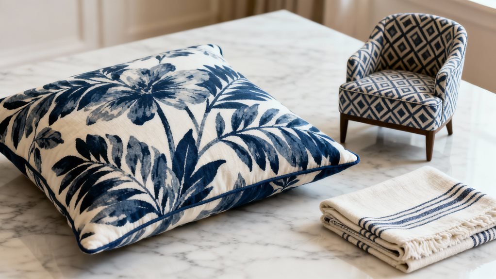
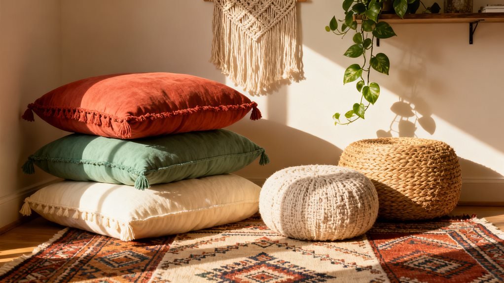
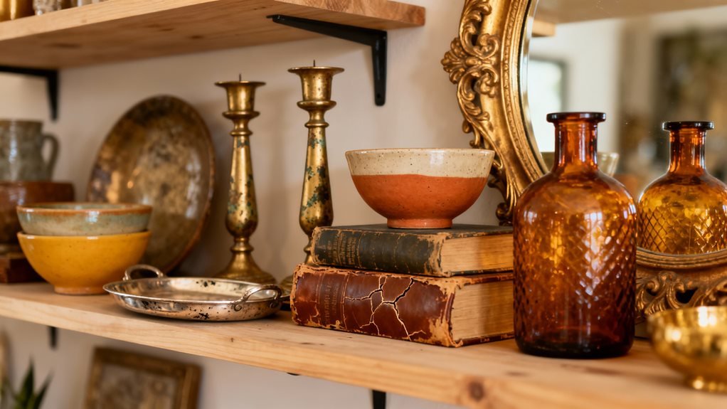
Mix Hard and Soft Surfaces for Visual Balance

mix hard and soft textures

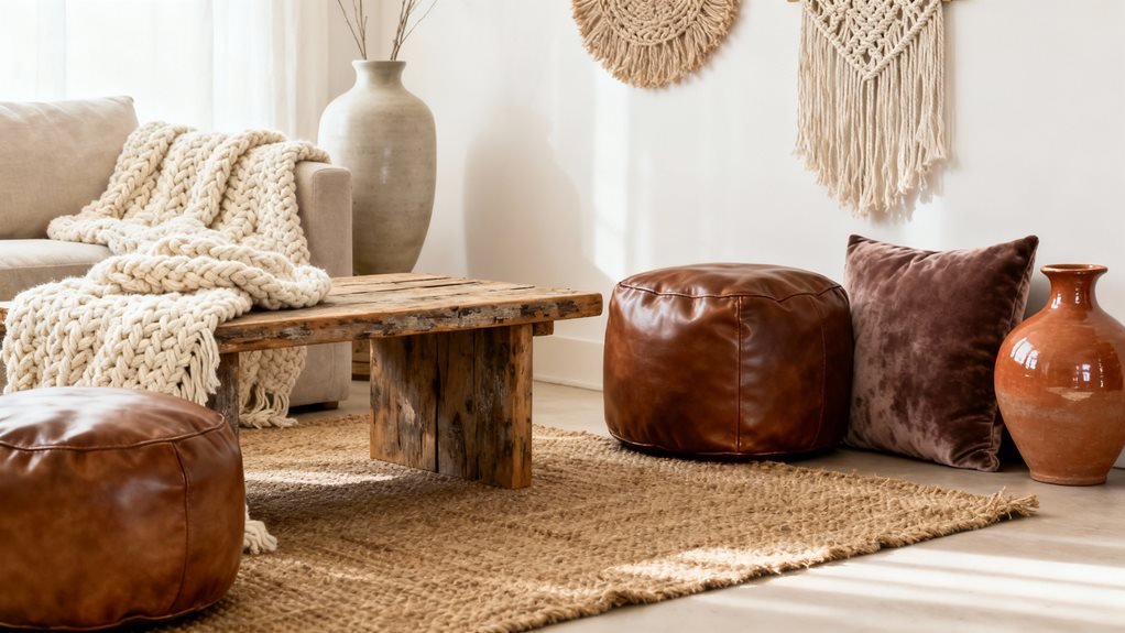
I’ve learned that the secret to a room that feels inviting rather than overwhelming is balancing rough textures with soft ones. When I pair my chunky wooden coffee table with a pile of velvet cushions, or drape a knitted throw over my metal-framed chair, the space instantly feels more livable. Try placing smooth stone coasters on plush fabric surfaces, or rest woven baskets against sleek furniture—this interplay creates depth that makes you want to sink in and stay awhile.

Wood Meets Plush Textiles

One of my favorite tricks for creating that signature boho warmth is pairing rough-hewn wood with touchably soft textiles. I’ll drape a chunky knit throw over my reclaimed wood coffee table, and suddenly the whole room feels inviting.

Here’s how I create this contrast:

  1. Layer sheepskin rugs over weathered wood floors – the juxtaposition makes you want to kick off your shoes immediately
  2. Rest velvet pillows against wooden chair backs – it’s like giving your furniture a warm hug
  3. Place woven baskets filled with soft blankets beside raw wood shelving – practical storage that doubles as texture play

The key is letting each material shine. Don’t hide your beautiful wood pieces; let plush textiles soften their edges naturally.

Stone Accents With Cushions

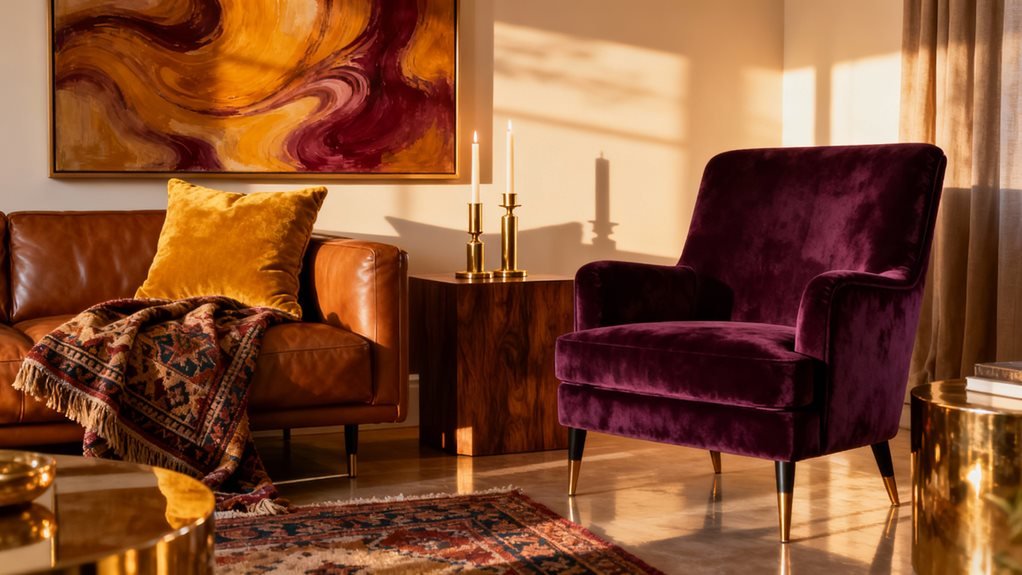
Natural stone surfaces bring an earthy grounding element to boho spaces, but they’ll make your room feel cold and uninviting without the right balance. I learned this after installing a gorgeous stone coffee table that dominated my living room like a museum piece. The fix? I piled on textured cushions everywhere—velvet floor pillows beside it, a chunky knit throw draped over my sofa nearby.

The contrast works beautifully. Place stone planters on side tables, then soften them with macramé cushions on adjacent seating. I’ve found that pairing slate coasters with fuzzy pillow clusters creates instant warmth. The key is maintaining a 60-40 ratio: for every hard stone element, add softer textiles within arm’s reach. This creates visual tension while keeping comfort front and center.

Metal Frames Plus Throws

Metal furniture frames used to intimidate me—they looked too industrial for the relaxed boho vibe I wanted. Then I discovered the magic of pairing them with soft throws, and everything changed. The contrast creates dimension that makes a room feel intentionally designed rather than randomly decorated.

Here’s how I balance metal with textiles:

  1. Drape a chunky knit throw over metal chair arms to soften sharp edges
  2. Layer a woven blanket across iron bed frames for warmth against cool surfaces
  3. Toss textured pillows onto metal-framed benches to invite people to sit

The key is treating metal as your foundation—it provides structure—while throws add the cozy, lived-in feeling. This combination keeps your space from feeling either too stark or overwhelmingly plush.

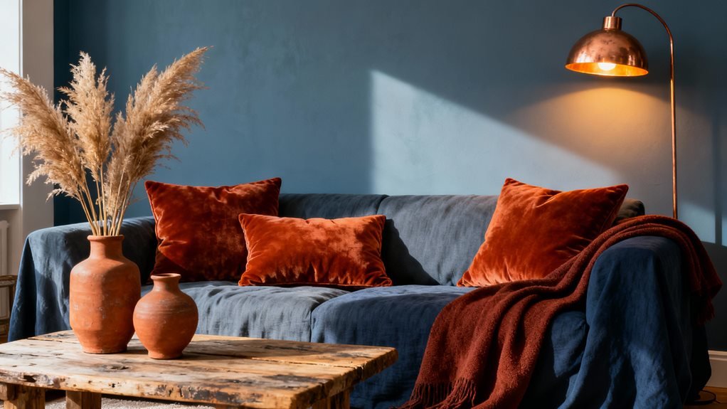
Create Depth With Varied Throw Pillows and Blankets

Throw pillows and blankets are my secret weapon for transforming a flat, boring couch into a textured bohemian haven. I’ve learned that mixing sizes, patterns, and materials creates visual interest that pulls the whole room together.

I always start with larger pillows in the back and layer smaller ones in front. Then I drape a chunky knit blanket over one arm and fold a lighter throw across the seat. This approach instantly adds dimension.

Texture Type Best Placement Visual Effect
Chunky Knit Draped over arm Creates volume
Velvet Pillows Front layer Adds luxury depth
Woven Throws Folded on seat Provides structure

Don’t match everything perfectly—that’s the beauty of boho style. I mix geometric prints with florals, smooth velvets with rough linens. The “imperfect” combinations create that lived-in, collected-over-time aesthetic we’re after.

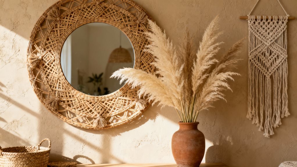
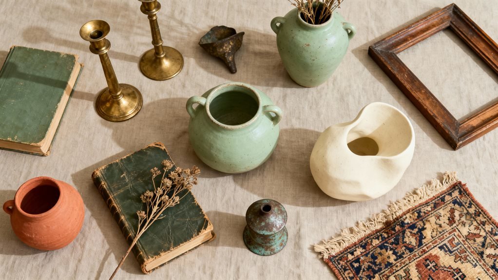
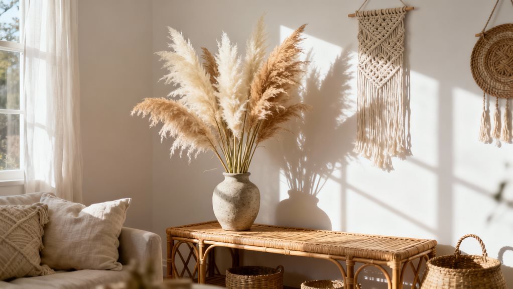
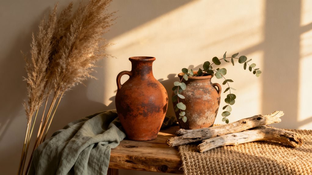
Finish With Organic Elements and Raw Materials

While textiles build up the soft layers, I’ve found that bringing in pieces straight from nature grounds the entire boho look. Raw wood coffee tables, stone planters, and woven seagrass baskets add an earthy foundation that prevents the space from feeling too decorated.

I keep a collection of organic elements that instantly warm up my living room:

  1. Driftwood branches in ceramic vases – They remind me of beach walks and add sculptural interest without trying too hard
  2. River rocks clustered on shelves – Smooth stones I’ve collected over the years that bring calm energy to the room
  3. Dried pampas grass in corners – These feathery plumes soften harsh angles and move gently with air flow

The beauty of organic materials is their imperfection. That knot in the wooden bowl, the irregular weave of a rattan tray – these details make your space feel lived-in and authentically yours rather than showroom-perfect.

Frequently Asked Questions

What Color Palette Works Best for a Boho Living Room?

I’ll never forget walking into my friend’s apartment and feeling instantly wrapped in warmth—her secret? Earthy terracotta, creamy whites, and sage greens layered throughout. I recommend starting with a neutral base, then adding burnt orange, mustard yellow, and deep rust tones. Don’t shy away from mixing warm and cool colors—I’ve paired dusty pink with olive green beautifully. The key is choosing shades that feel organic and sun-kissed, like they’ve been naturally weathered over time.

How Do I Prevent a Boho Room From Looking Too Cluttered?

I keep my boho space balanced by following the “rule of three”—grouping decorative items in odd numbers instead of scattering everything around. I’ll also stick to two or three main colors throughout, even with varied patterns. What’s really helped me is creating intentional negative space—I leave some surfaces bare so the eye can rest. Don’t be afraid to edit ruthlessly; I regularly remove pieces that don’t earn their spot!

What’s the Ideal Budget for Creating a Boho Living Room?

I’ll be honest—I created my first boho space for under $300! Funny enough, that’s when a friend asked me the same question you did. Here’s what I’ve learned: you can start with $200-500 for basics, or splurge up to $2,000+ for quality pieces. I always recommend beginning small with thrifted finds and DIY projects. You’ll discover your style without breaking the bank, then invest in statement pieces later.

Can Boho Style Work in Small Living Spaces?

I’ve styled tiny apartments where boho actually thrived. The key is editing—I choose multifunctional pieces like a pouf that’s both seating and storage. I’ll hang one statement macramé piece instead of cluttering walls, and I layer smaller textiles like throw pillows rather than bulky blankets. Vertical space becomes your best friend; I always add floating shelves for plants. Trust me, you don’t need square footage to create that relaxed, layered boho vibe.

How Do I Maintain and Clean Natural Fiber Materials?

I vacuum my jute rugs weekly and spot-clean spills immediately with a damp cloth—never soak them! For rattan furniture, I wipe it down with a slightly damp microfiber cloth and mild soap. Here’s my game-changer: I rotate my natural fiber pieces seasonally to prevent uneven wear. Also, keep them away from direct sunlight and humidity. I learned the hard way that prevention beats restoration—my first sisal rug faded terribly before I figured this out!

secret to mixing patterns steps

The Secret to Mixing Patterns Without Overwhelm in Steps

I’ve found the secret to mixing patterns is starting with a unifying color palette of three to five shades, then choosing patterns in three distinct scales—large, medium, and small. I always select one dominant anchor pattern that takes up about 60% of the visual space, then layer in supporting designs while using solid neutrals as breathing room between busier prints. I test combinations with swatches before committing, and I’m never afraid to swap elements until the balance feels just right—there’s so much more to explore about creating this harmony.

Design Highlights

  • Establish a unifying palette of three to five colors, selecting one or two dominant hues plus coordinating accent shades.
  • Choose an anchor pattern claiming 60% visual space, then layer medium (30%) and small-scale (10%) patterns around it.
  • Pair one busy, bold pattern with simpler, quieter designs to create visual breathing room and prevent overwhelming the space.
  • Incorporate solid colors and neutral anchors between patterns to ground the design and allow the eye to rest.
  • Test combinations using swatches in your actual space, adjusting one pattern at a time until balance feels intentional.

Start With a Unifying Color Palette

unified color palette for cohesive patterns

The easiest way to mix patterns successfully is to choose three to five colors that will appear throughout your space. I recommend selecting one or two dominant colors, plus a few accent shades. This creates cohesion even when your patterns vary wildly in style.

Here’s what I do: I pull colors from a favorite piece I already own—maybe a patterned rug or artwork. Then I ensure each additional pattern incorporates at least one of those colors. It doesn’t need to match perfectly; similar tones work beautifully.

You’ll notice that when patterns share a color story, they feel intentional rather than chaotic. A floral pillow, geometric throw, and striped curtains can absolutely coexist when they’re speaking the same color language.

Start by laying out your patterned pieces together. If the colors complement each other, you’re on the right track. This simple foundation makes everything else fall into place effortlessly.

Master the Rule of Three Pattern Scales

three pattern scales create harmony

One of my favorite tricks for pattern mixing is varying the scale—and it’s simpler than you might think. I use three distinct pattern sizes in each room: large, medium, and small. This creates visual hierarchy and prevents patterns from competing with each other.

Here’s how I break it down:

Scale Pattern Size Best Used On
Large 6+ inches Curtains, duvets, rugs
Medium 2-6 inches Throw pillows, chairs
Small Under 2 inches Accent pillows, artwork

For example, I’ll pair large-scale floral curtains with medium geometric pillows and small dotted throws. The key is ensuring each pattern has its own space to breathe. When you vary the scale this way, your eye naturally moves around the room without getting stuck or overwhelmed. Start with one large statement pattern, then layer in your medium and small supporting players.

Anchor Your Design With a Dominant Pattern

anchor dominates pattern harmony 60 30 10

Every successful pattern-mixed room needs a hero—that one dominant pattern that sets the tone and tells the others what to do. I always choose my anchor pattern first, letting it claim the most visual real estate in the space. This might be your curtains, a statement rug, or an upholstered sofa.

Your dominant pattern should reflect the room’s personality. If you’re going bold, pick something with strong contrast and scale. For a softer approach, choose a large-scale floral or geometric with gentler colors.

Once you’ve selected your anchor, pull colors directly from it for your supporting patterns. This creates instant cohesion. I typically let my dominant pattern cover 60% of the pattern distribution in the room, leaving 30% for a medium-scale secondary pattern and 10% for accent patterns.

Think of your anchor as the conductor of an orchestra—it doesn’t play every instrument, but it guides everything else into harmony.

Balance Busy Prints With Simpler Designs

one busy one calm balance

After establishing your anchor pattern, you’ll need breathing room to keep the design from tipping into chaos. I’ve learned that the most successful pattern combinations follow a simple rhythm: one busy, one calm.

Think of it like a conversation. If everyone’s shouting, nobody’s heard. Your dominant pattern already makes a bold statement, so pair it with quieter designs that give the eye a place to rest.

I recommend using small-scale patterns or textures alongside your statement piece. A geometric print works beautifully with subtle stripes. Florals sing when balanced with solid-colored linen or a barely-there dot.

The ratio matters too. I typically aim for 60% dominant pattern, 30% medium-scale design, and 10% simple texture. This creates visual hierarchy without competition.

Use Solids as Visual Breathing Room

solid colors create calm visual breaks

Solid colors are your secret weapon when patterns start feeling overwhelming. I’ve found that adding plain fabrics or painted surfaces between patterned pieces gives your eyes a place to rest. Think of solids as the pause between musical notes—they make everything else shine brighter.

When I’m styling a room, I’ll use solid throw pillows alongside patterned ones, or place a solid-colored chair next to a patterned sofa. This creates natural breaks that prevent visual chaos. You don’t need equal amounts of solids and patterns; even small touches work wonders.

Try starting with neutrals like cream, gray, or soft white for your solid pieces. They’re incredibly forgiving and complement almost any pattern combination. If you’re feeling bold, use a solid color that pulls from one of your patterns.

The key is intentionality. Place your solids strategically where you want to create calm, balanced moments in your space.

Test Your Combinations Before Committing

How can you be sure your pattern choices will actually work together? I always test combinations before making permanent decisions.

Start by gathering fabric swatches, wallpaper samples, or even photos of patterned items you’re considering. Arrange them together in the actual space where they’ll live. Natural lighting reveals how colors and patterns truly interact throughout the day.

I recommend the “step back” test. Place your samples together, then walk away for a few minutes. Return with fresh eyes—you’ll immediately sense whether the combination feels harmonious or chaotic.

Take photos with your phone. The camera often exposes clashing elements your eye might miss in person. Review these images away from the space to gain objective perspective.

If something feels off, swap one pattern at a time until you achieve balance. This methodical approach prevents costly mistakes and builds your confidence. You’ll know when you’ve found the right mix—it’ll simply feel right.

Trust Your Eye and Adjust as Needed

After you’ve tested your pattern combinations, I encourage you to physically step back from the space—yes, literally move several feet away. From this distance, you’ll notice how the patterns interact as a whole rather than as individual pieces competing for attention. If something feels off, trust that instinct and rearrange elements until the room achieves the balanced, cohesive look you’re after.

Step Back, Assess Overall

Sometimes the magic happens when you literally take three steps backward and let your eyes do the talking. I’ve found that physical distance gives you a fresh perspective on whether your patterns are singing together or shouting at each other.

Here’s what I look for:

What to Check Good Sign Red Flag
Eye movement Flows naturally around the room Gets stuck in one spot
Energy level Balanced and inviting Chaotic or overwhelming
Color distribution Evenly spread throughout Clumped in one area
Pattern dominance One clear star, others support Everything competing equally
Overall feeling Cohesive and intentional Random and disconnected

Take a photo on your phone—it reveals what your brain might be overlooking. Trust what you see from that distance.

Rearrange Until It Feels Right

What if I told you that perfect pattern mixing doesn’t exist on the first try? It’s all about rearranging until something clicks. I move pillows between rooms, swap throws, and shift artwork constantly. This isn’t indecision—it’s refinement.

Trust what your eye tells you. If something feels off, it probably is. Don’t overthink it; just adjust.

Here’s my rearranging process:

  • Move one element at a time – Swap a single pillow or piece rather than redoing everything
  • Step away for an hour – Fresh eyes reveal what’s working and what isn’t
  • Take photos from different angles – Your camera catches imbalances you might miss
  • Live with it temporarily – Sometimes patterns grow on you after a few days

Keep tweaking until the space feels balanced and intentional.

Frequently Asked Questions

What Are the Best Patterns for Small Spaces Versus Large Rooms?

I’ve seen massive florals completely swallow tiny rooms whole! For small spaces, I recommend you stick with smaller-scale patterns like mini geometrics, delicate stripes, or petite prints. They’ll make your room feel open and airy. In large rooms, you’ve got freedom to go bold with oversized florals, dramatic damasks, or chunky plaids. These bigger patterns won’t get lost in expansive spaces. Just remember, you’re creating visual balance, not chaos!

How Do I Mix Patterns Across Different Rooms While Maintaining Flow?

I create flow between rooms by choosing one consistent element—like a color palette or pattern scale—that threads through each space. For example, if I’m using bold geometrics in my living room, I’ll echo those colors in a softer floral print in the adjacent dining room. I also keep my hallways relatively neutral so they act as visual “breathers” between patterned spaces. This way, each room feels distinct yet connected.

Can I Mix Patterns From Different Design Styles Like Modern and Traditional?

I love mixing modern and traditional patterns—it creates such rich, layered spaces. The key is finding a common thread to unite them. Try matching color palettes, keeping similar scale between patterns, or using the same material (like both being textiles or wallpapers). For example, pair a geometric modern print with a classic floral if they share the same navy blue. This contrast actually makes rooms feel more collected and personal than matchy-matchy.

What’s the Difference Between Mixing Patterns in Decor Versus Fashion Styling?

The main difference is permanence and scale. In fashion, you’re mixing patterns on a single moving canvas—your body—where everything shifts with you. I can experiment freely because I’ll change tomorrow! In decor, patterns stay put and interact with lighting, furniture, and architecture long-term. You’ll live with those choices daily, so I need to be more strategic about placement, scale variation, and ensuring patterns complement the room’s fixed elements rather than competing.

How Often Should I Update or Rotate Patterned Pieces in My Space?

I’d suggest refreshing your patterned pieces seasonally—about every three to four months. This keeps your space feeling current without overwhelming your budget or energy. You don’t need to replace everything; simply swap out smaller items like throw pillows, blankets, or artwork. I’ve found that rotating patterns with the seasons creates natural variety while maintaining your core design. If you’re loving your current mix, though, there’s absolutely no pressure to change anything until you’re ready for something new.

budget friendly boho eclectic finds 2025

7 Budget-Friendly Finds That Nail the Boho-Eclectic Look in 2025

I’ve found that nailing the boho-eclectic look in 2025 comes down to seven budget-friendly essentials: oversized floor cushions and poufs under $50, textured woven wall hangings that go beyond basic macramé, vintage-look Turkish and Moroccan rugs ($60-$300), rattan accent chairs and storage baskets under $150, globally-inspired throw pillows that layer patterns beautifully, handcrafted ceramic planters with reactive glazes, and woven pendant lights paired with warm string lights. Each piece adds that layered, traveled vibe without breaking the bank, and I’ll show you exactly where to find them all.

Design Highlights

  • Oversized floor cushions and poufs under $50 transform spaces into cozy reading nooks or meditation corners with moveable, space-saving versatility.
  • Vintage-look Turkish and Moroccan rugs ($60-$300) anchor rooms with faded reds, sun-bleached blues, and imperfect patterns that hide wear.
  • Rattan accent chairs, woven baskets, and seagrass ottomans under $150 mix different weaves for authentic boho texture and global character.
  • Textured woven wall hangings layer chunky fibers like jute, wool, and raffia over thinner tapestries for affordable artisan-inspired depth.
  • Woven pendant lights under $60 and warm-white string lights around $15 create layered ambiance at varying heights without sacrificing budget.

Oversized Floor Cushions and Poufs That Transform Any Corner

oversized floor cushions transform spaces

How can a single piece completely reimagine your living space without breaking the bank? I’ve discovered that oversized floor cushions and poufs are absolute game-changers for nailing that boho-eclectic vibe.

These versatile pieces instantly create cozy reading nooks, extra seating for impromptu gatherings, or meditation corners that feel intentionally curated. I’m obsessed with how they soften hard lines and add instant texture to empty spaces.

The best part? You’ll find stunning options under $50. Look for Moroccan-inspired leather poufs, chunky knit cushions in earthy tones, or vibrant patterned pillows that showcase global textiles. I recommend mixing different sizes and textures—pair a structured pouf with a slouchy floor cushion for visual interest.

They’re incredibly practical too. I move mine around constantly, tucking them away when I need floor space and pulling them out for movie nights. This flexible approach to seating perfectly captures the relaxed, collected-over-time aesthetic that defines boho style.

Textured Woven Wall Hangings Beyond Basic Macramé

textured woven wall hangings flourish

I’ve moved beyond macramé and discovered that mixing fiber types—like jute, wool, and even raffia—creates way more visual interest on my walls. Layering a chunky woven piece over a thinner tapestry adds that coveted depth without looking too matchy-matchy. The best part? Sites like Etsy, World Market, and even Target now carry artisan-inspired wall hangings that look expensive but won’t wreck your budget.

Fiber Types Beyond Cotton

Why settle for standard cotton macramé when wool, jute, and bamboo fibers can transform your walls into tactile masterpieces? I’ve discovered that mixing fiber types creates dimensional depth that cotton alone can’t achieve.

Wool adds luxurious thickness and catches light beautifully—plus it’s naturally stain-resistant. Jute brings that rustic, earthy texture that screams bohemian authenticity without the hefty price tag. I found gorgeous jute pieces at discount home stores for under $25.

Bamboo fiber hangings offer an unexpected silky sheen that elevates the eclectic vibe instantly. They’re also eco-friendly, which appeals to my sustainable decorating goals.

Here’s my trick: layer different fiber textures in one gallery wall. The contrast between rough jute and smooth bamboo creates visual interest that makes your space feel curated, not mass-produced.

Layering Textures for Depth

The real magic happens when you stack different weaving techniques in one piece—or better yet, across multiple hangings in the same space. I’ve found that mixing rya knots with soumak weaving creates incredible visual interest without spending extra cash.

Texture Combination Visual Effect
Rya + Soumak Shaggy meets structured
Loop pile + Flat weave Sculptural dimension
Fringe + Twining Movement and stability
Pile variations + Plain weave High-low contrast
Mixed fiber gauges Organic irregularity

Here’s my approach: I hunt for pieces where the weaver’s already done the mixing, or I’ll grab three smaller weavings with contrasting textures and cluster them. The depth you’ll achieve makes your wall look professionally curated, not like you grabbed one lonely macramé piece from Target.

Affordable Artisan-Inspired Sources

Where can you score these textured treasures without draining your checking account? I’ve discovered that Etsy’s “handmade” filter reveals independent artisans selling stunning woven pieces at fraction-of-gallery prices. World Market consistently stocks globally-inspired textiles that look custom-made. Target’s Opalhouse line surprises me every season with affordable boho finds that rival boutique shops.

Don’t overlook Facebook Marketplace and local craft fairs—I’ve snagged one-of-a-kind tapestries for under $30. HomeGoods rotates artisan-style inventory weekly, so I check regularly. For genuine handcrafted pieces, I follow small makers on Instagram who often announce flash sales.

Thrift stores hide vintage woven baskets and textile art that add instant authenticity. I’ve transformed $5 thrifted pieces into statement wall art by simply adding wooden dowels.

Vintage-Look Turkish and Moroccan Area Rugs

vintage look rug options and prices

Nothing transforms a room quite like a richly patterned rug beneath your feet, and vintage-look Turkish and Moroccan styles have become the cornerstone of boho-eclectic design. I’ve found incredible budget-friendly options that deliver authentic vibes without the hefty price tag.

Here’s what I look for when shopping:

Style Price Range Best For
Distressed Turkish $80-$200 High-traffic areas
Moroccan Beni Ourain $100-$250 Bedrooms and living rooms
Kilim Flatweave $60-$150 Layering and small spaces
Oushak-Inspired $120-$300 Statement pieces
Tribal Geometric $75-$180 Eclectic mixing

Retailers like Rugs USA, Boutique Rugs, and even Amazon offer machine-washable versions that mimic hand-knotted originals. I’m particularly drawn to faded reds, sun-bleached blues, and weathered terracottas. The key is embracing imperfect patterns—they add character and hide wear beautifully.

Rattan and Natural Fiber Furniture Pieces

rattan and natural fiber mix

Once you’ve anchored your space with the perfect rug, it’s time to bring in furniture that breathes texture and warmth into every corner. I’m obsessed with rattan and natural fiber pieces right now—they’re the backbone of authentic boho style without the hefty price tag.

Look for rattan accent chairs, woven storage baskets, and seagrass ottomans at places like Target, World Market, and HomeGoods. I’ve scored incredible pieces under $150 that look straight out of a designer’s portfolio. The beauty of these materials is their versatility—they work equally well in minimalist spaces and maximalist settings.

Don’t overlook secondhand shops either. I’ve found vintage rattan headboards and peacock chairs for a fraction of retail prices. The natural wear adds character that new pieces simply can’t replicate.

Mix different weaves and tones—pair tight-weave rattan with chunky jute or bamboo. This layering creates visual interest while maintaining that organic, earthy vibe.

Globally-Inspired Throw Pillows and Textile Mixes

global mix of handmade textiles

Textiles are where boho-eclectic style truly comes alive—and throw pillows are your secret weapon for instant transformation. I’ve found that mixing patterns, textures, and cultural influences creates that coveted lived-in look without breaking the bank.

Here’s my approach to building a stunning textile collection:

  1. Mix global patterns freely – Pair Moroccan geometric prints with Indian block prints and Turkish suzanis. Don’t worry about matching perfectly; that’s the point.
  2. Layer different textures – Combine smooth cotton with chunky knits, velvet with linen, and macramé with embroidered pieces. This creates visual depth instantly.
  3. Embrace handmade imperfections – Look for pillows with irregular stitching or slightly faded colors. These authentic touches add character that machine-made versions can’t replicate.

I shop discount home stores, online marketplaces, and even thrift shops to find unique pieces. The key is collecting gradually and choosing what genuinely speaks to you.

Terracotta and Ceramic Planters With Artisan Appeal

I’m obsessed with how terracotta and ceramic planters can transform a space without draining your wallet. The secret to that expensive, artisan look is mixing textured finishes—think matte earth tones, reactive glazes with unexpected color variations, and hand-carved details that catch the light. I always cluster different sizes together, from tiny 3-inch pots on shelves to statement floor planters, because that layered approach creates visual interest that screams “collected over time” rather than “bought all at once.”

Textured Finishes and Glazes

Why settle for mass-produced planters when handcrafted ceramic pieces bring so much character to your space? I’ve discovered that textured finishes and unique glazes transform ordinary planters into statement pieces without the artisan price tag.

Here’s what I look for when hunting down budget-friendly ceramic planters:

  1. Reactive glazes that create unpredictable color variations—no two pieces look identical
  2. Hand-carved patterns or stamped designs that add tactile dimension
  3. Matte finishes mixed with glossy drips for that coveted handmade aesthetic

I’ve found incredible options at discount home stores and online marketplaces where small-batch producers sell directly. The imperfections—slight color inconsistencies, uneven textures—actually enhance the boho-eclectic vibe. These finishes catch light beautifully and add depth that plain terracotta simply can’t match.

Mixed Sizes for Layering

The magic of boho-eclectic styling happens when you cluster planters of varying heights and widths rather than sticking to matching sets. I’ve found that mixing a tall 12-inch cylinder with squat 4-inch bowls creates visual interest that feels collected over time. This layered approach lets you showcase different plants while building dimension on shelves, windowsills, or floor corners.

Size Combination Visual Impact
Tall (10-14″) + Medium (6-8″) Creates vertical drama
Small clusters (3-5″) Adds intimate detail
Wide bowls (8-10″) + Narrow pots Balances proportions
Graduated trio (small to large) Guides the eye naturally

I’m particularly drawn to groupings of three or five planters—odd numbers feel more organic and less staged than even arrangements.

Layered Lighting With Woven Pendants and String Accents

When it comes to nailing that boho-eclectic vibe, lighting does some serious heavy lifting—and I’m obsessed with how woven pendants paired with delicate string lights create instant warmth without demolishing your budget.

I’ve found the magic happens when you layer different light sources at varying heights. Here’s my go-to formula:

  1. Hang a rattan or bamboo pendant over your dining table or in a corner—look for ones under $60 at HomeGoods or Target
  2. Drape warm-white string lights along exposed beams, around windows, or across your headboard for that dreamy glow
  3. Add a woven basket pendant in your entryway or bedroom for texture that photographs beautifully

The trick is mixing structured pendants with softer, twinkling accents. This combination creates depth and makes spaces feel curated rather than cookie-cutter. I’ve scored gorgeous woven fixtures for under $50, and quality string lights run about $15—totally doable for transforming your space.

Frequently Asked Questions

How Do I Clean and Maintain Natural Fiber Furniture Pieces?

I’ll regularly vacuum your natural fiber pieces with a brush attachment, then spot-clean spills immediately with a damp cloth and mild soap. Here’s what fascinates me: natural fibers can last 15+ years with proper care—that’s incredible value! I recommend rotating cushions monthly and keeping pieces away from direct sunlight to prevent fading. For deeper cleaning, I’ll use a specialized upholstery cleaner designed for natural materials. Quick maintenance truly makes these boho treasures last forever!

What’s the Best Way to Mix Patterns Without Overwhelming a Room?

I always stick to a simple rule: vary your pattern scales! I’ll pair a large-scale floral with small geometric prints, then anchor everything with a solid neutral. I keep my color palette consistent across patterns—maybe three main colors max—so nothing fights for attention. Here’s my secret: I distribute patterns throughout the room rather than clustering them in one spot. This creates visual balance and lets each piece shine without overwhelming your space.

Can Boho-Eclectic Style Work in Small Apartments or Studio Spaces?

I’ve found that 68% of renters now live in spaces under 900 square feet, and boho-eclectic actually thrives in cozy quarters. I recommend using vertical space with hanging plants and floating shelves to draw the eye upward. You’ll want to choose multipurpose furniture—like a vintage trunk doubling as storage and a coffee table. Keep your color palette cohesive while mixing textures and patterns. It’s about curating intentionally rather than cluttering!

How Do I Prevent My Space From Looking Cluttered With Layered Decor?

I’ll keep your space balanced by using the “rule of three”—grouping decor items in odd numbers creates visual harmony without chaos. I’m strategic about negative space, letting walls and surfaces breathe between vignettes. I’ll stick to a cohesive color palette (even if it’s varied) and use vertical storage like wall shelves to layer upward, not outward. Regular editing is key—I rotate accessories seasonally, keeping only what truly sparks joy and serves the room’s vibe.

Where Can I Find Authentic Vintage Pieces on a Tight Budget?

I hit up estate sales at dawn, I browse thrift stores on half-price days, I scroll Facebook Marketplace religiously—these are my treasure-hunting grounds! You’ll find incredible vintage pieces for pennies when you’re strategic. I’ve scored amazing finds by checking local flea markets early Saturday mornings and joining community swap groups. Don’t overlook Goodwill’s online auctions either—I’ve snagged authenticated mid-century pieces there. The key? Consistency and patience always pay off!

boho walls in seven steps

Turning Blank Walls Into Boho Statement Spaces: 7 Simple Steps

I transformed my bland apartment walls by starting with a substantial macramé piece that made me smile, then layering in rattan mirrors and pampas grass for natural warmth. I created an eclectic gallery wall with mismatched vintage frames, added floating shelves with trailing plants, and hung a Turkish kilim as textile art. Warm Edison bulbs and handmade ceramics from my travels became the finishing touches. Each layer built upon the last, turning empty space into a curated sanctuary that tells my story—and yours can too once you understand how these elements work together.

Design Highlights

  • Start with a large textured anchor piece (24+ inches) in natural fibers like cotton, jute, or wool to establish design direction.
  • Layer natural elements including rattan mirrors, pampas grass in floor vases, and eucalyptus branches to add depth and dimension.
  • Install three staggered floating shelves at different heights, mixing trailing plants, vintage brass items, and books with one-third empty space.
  • Create a gallery wall using mismatched vintage frames with 2-3 inch spacing, arranging pieces on the floor before hanging.
  • Hang vintage rugs as art using curtain rods or Velcro strips, layer textiles for depth, and add warm Edison lighting.

Start With a Textured Anchor Piece Like a Macramé Wall Hanging or Woven Tapestry

textured anchor piece defines palette

Why do the most alluring boho walls always seem to start with one stunning textured piece? I’ve learned it’s because texture creates instant visual interest and sets your entire design direction.

When I decorated my first apartment, I hung a large macramé piece above my couch, and suddenly everything else fell into place. That anchor piece told me exactly what colors, patterns, and additional elements would work.

Choose something substantial—at least 24 inches wide for impact. I prefer pieces with natural fibers like cotton, jute, or wool because they add warmth and authenticity.

Here’s my practical tip: hang your anchor piece first, then step back and live with it for a day or two. You’ll notice how the light hits it differently throughout the day, which helps you decide what to add next.

Don’t overthink this step. Your anchor piece should simply make you smile every time you see it.

Layer in Natural Elements With Rattan Mirrors and Dried Pampas Grass

rattan mirror pampas grace balance

Once you’ve got your textured anchor piece up, natural elements become your secret weapon for building depth. I learned this after my living room wall looked flat despite having a gorgeous macramé hanging. Adding a rattan mirror changed everything.

Here’s how I arrange natural elements for maximum impact:

Element Placement Effect Vase Style
Pampas grass (3-5 stems) Floor corner Adds height Large ceramic
Rattan mirror Slightly off-center Creates dimension N/A
Eucalyptus branches Side table Brings movement Tall glass
Palm leaves Opposite corner Balances composition Woven basket

Position your rattan mirror where it’ll catch natural light—this amplifies the boho warmth. I place mine about 6 inches away from my tapestry, creating intentional negative space.

For pampas grass, go with odd numbers. Three stems in a floor vase instantly adds that effortless, beachy vibe without overwhelming your wall arrangement.

vintage frames eclectic artwork arranged deliberately

I’ve spent countless weekends hunting through flea markets and estate sales for vintage frames, and I’ve learned that the magic of a boho gallery wall lies in embracing the mismatch. The key is mixing ornate gold frames with simple wooden ones, pairing abstract prints alongside vintage botanical illustrations, and creating a layout that feels intentionally imperfect. Before you hammer a single nail, I recommend arranging everything on the floor first—this lets you play with spacing and composition until you find that sweet spot where eclectic feels cohesive rather than chaotic.

Sourcing Authentic Vintage Frames

The thrill of finding the perfect vintage frame at a dusty estate sale never gets old for me—there’s something magical about rescuing ornate gold frames with chipped corners or weathered wood pieces that tell their own stories. I’ve discovered my best sources through trial and error, and I’m sharing my go-to spots:

Source Type Why I Love It
Estate Sales Authentic pieces with history, reasonable prices
Thrift Stores Weekly inventory turnover, hidden gems
Antique Markets Curated selection, negotiable pricing

I always check frames for sturdy backing and glass quality. Don’t worry about perfect condition—imperfections add character. My rule: if it catches my eye and feels substantial, I grab it. Mix different finishes and sizes for that authentic boho look.

Mixing Art Styles Effectively

Now that you’ve collected those beautiful frames, let’s talk about what actually goes inside them—and this is where most people freeze up.

I’ll be honest: I once spent three hours rearranging my gallery wall because I’d grouped all my abstracts together. It looked sterile, not boho.

Here’s what works: alternate between different art styles. Place a vintage botanical print next to modern line art, then add a woven piece or small mirror. The key is intentional chaos—each piece should feel different, but they’ll harmonize through your frame selection.

I follow the “rule of three”: never hang more than three similar styles consecutively. Mix mediums too—photography, paintings, textiles, and prints all deserve space.

Trust your gut. If something feels off, it probably is.

Layout Planning and Spacing

Before you hammer a single nail, lay everything on the floor. I learned this the hard way after patching twelve holes in my living room wall. Arrange your frames exactly as they’ll hang, then measure the spacing between each piece. I keep mine between 2-3 inches for that relaxed boho vibe.

Frame Size Ideal Spacing Best Placement
Large (16×20″) 3-4 inches Center/anchor points
Medium (11×14″) 2-3 inches Secondary focus areas
Small (5×7″) 2 inches Fill gaps, corners
Oversized (20×24″+) 4-5 inches Statement pieces
Tiny (4×6″) 1-2 inches Cluster groupings

Snap a photo of your floor layout before hanging. You’ll thank me later.

Add Dimension With Floating Shelves Styled With Plants and Treasures

three staggered shelves varied heights

Floating shelves transformed my boring bedroom wall from flat and forgettable into a layered gallery that actually makes me smile every morning.

I installed three staggered shelves at different heights, creating visual interest instead of a rigid horizontal line. The key is mixing textures and heights—I paired trailing pothos with small succulents, vintage brass candlesticks, and a few favorite books stacked horizontally.

Don’t overcrowd your shelves. I leave about one-third of each shelf empty, letting items breathe. This prevents that cluttered thrift-store vibe and keeps things intentionally boho.

For plant placement, I position trailing varieties at shelf ends where they can cascade naturally. Smaller treasures like crystals, vintage finds, or handmade pottery fill middle sections.

Pro tip: Arrange items in odd numbers—groups of three or five look more organic than pairs. I rotate seasonal elements monthly, swapping dried flowers for fresh greenery or switching out decorative objects to keep my wall display feeling fresh and curated.

Incorporate Global-Inspired Textiles Like Kilim Rugs or Embroidered Fabrics

global kilim inspired textile collection displayed

I fell in love with textiles during a trip to Morocco, where I watched weavers create intricate kilim patterns by hand—and I’ve been hanging rugs on my walls ever since. The key is choosing pieces with authentic patterns that tell a story, whether it’s a vintage Turkish kilim or hand-embroidered Suzani fabric from Central Asia. I layer these textiles at different heights and mix various textures to create depth, turning what could be simple wall hangings into a gallery of global craftsmanship.

Choosing Authentic Textile Patterns

When I first started collecting textiles for my walls, I made the rookie mistake of grabbing anything with geometric patterns, thinking it looked “boho enough.” What I’ve learned since then is that authentic global textiles carry stories in their weave—and that depth is what transforms a wall from decorated to genuinely riveting.

Here’s what I now look for:

  • Turkish kilims with their flat-weave construction and symbolic motifs representing protection or fertility
  • Moroccan wedding blankets featuring sequined diamond patterns against handwoven wool
  • Indian kantha quilts showcasing running-stitch embroidery in vibrant, layered colors
  • Mexican serapes displaying bold stripes in naturally dyed yarns
  • Indonesian ikat with its distinctive blurred edges from resist-dyeing techniques

I source mine from fair-trade cooperatives and ethical vintage dealers who can verify origin stories.

Hanging Rugs as Art

I’ve hung vintage kilims in every home I’ve lived in, and they’ve become my favorite focal points. The key is choosing rugs with compelling patterns—Turkish kilims, Moroccan boucherouite, or Indian dhurries work beautifully.

For hanging, I use a simple curtain rod slipped through the rug’s weave or a Velcro strip attached to a wooden board. Never use nails directly through the fabric.

I’ve learned that smaller rugs (3×5 feet) work best above sofas or beds, while runners look stunning in narrow hallways. The texture adds warmth that flat art simply can’t match.

Layering Fabrics for Depth

Why stop at just one textile when you can create a rich, dimensional display? I’ve found that layering different fabrics transforms a flat wall into something truly alluring. My favorite approach? I’ll hang a large kilim rug as the base, then overlap it with a smaller embroidered Suzani throw or vintage tapestry.

Here’s what works beautifully together:

  • A faded Turkish kilim beneath a vibrant Moroccan wedding blanket
  • Neutral jute wall hanging layered with colorful Indian block-print fabric
  • Vintage tapestry paired with a macramé piece for texture contrast
  • Indonesian batik cloth underneath a smaller embroidered panel
  • Guatemalan textiles mixed with Mexican woven blankets

The key is varying textures and scales while maintaining a cohesive color story. This creates depth that makes your wall feel intentionally curated rather than cluttered.

Mix in Warm Lighting With String Lights or Woven Pendant Lamps

Lighting transforms a bare wall from flat to [captivating] faster than any other design element I’ve tried. I discovered this when I hung Edison bulb string lights above my bedroom tapestry—suddenly, the whole space felt alive and intentional.

I recommend positioning string lights in a gentle swag pattern or draping them around wall hangings to create ambient glow. For a more polished look, I’ll mount a woven rattan pendant lamp slightly off-center from the wall arrangement. The natural texture casts beautiful shadows that change throughout the day.

Here’s what works: warm white bulbs (2700K-3000K) give that signature boho warmth without feeling too yellow. I avoid cool white bulbs—they kill the cozy vibe instantly.

Pro tip: Install a dimmer switch. I can adjust the mood from bright and energizing during the day to soft and relaxing at night. This flexibility makes the wall display feel dynamic rather than static.

Finish With Personal Touches Like Travel Souvenirs and Handmade Ceramics

The moment I placed my grandmother’s hand-thrown ceramic bowl on a floating shelf next to a woven basket from Morocco, my wall display finally felt like *mine*. That’s when I realized boho style isn’t about buying the trendiest pieces—it’s about curating items that tell your story.

I’ve learned to layer these personal treasures throughout my wall arrangements:

  • Vintage postcards from flea markets tucked into macramé holders
  • Small terra-cotta planters I made during a pottery class
  • A brass compass from my hiking trip through Peru
  • Hand-painted tiles collected from different neighborhoods
  • My best friend’s handmade candles on decorative ledges

These finishing touches transform your space from “Pinterest board” to “this is where I actually live.” I always leave gaps between items so each piece can breathe and catch your eye. The imperfections in handmade ceramics and weathered souvenirs add character that mass-produced décor simply can’t replicate.

Frequently Asked Questions

How Do I Hang Heavy Wall Decor Without Damaging Rental Walls?

I’ve rescued my security deposit more times than I can count! For heavy boho pieces, I swear by adhesive hooks rated for the weight—they peel off cleanly. I also use picture-hanging strips for mirrors and woven art. My favorite trick? Lean oversized pieces against the wall on a console table instead of hanging them. Command strips have never failed me, but always check the weight limit first. Your landlord will thank you!

I like to eyeball 2-3 inches between pieces—think of it as giving each item room to breathe while keeping that cozy, collected vibe alive. When I created my bedroom gallery wall, I started tighter (around 2 inches) for smaller pieces and went wider for larger ones. Here’s my trick: lay everything on the floor first, snap a photo, then replicate it on your wall. It’s foolproof!

How Can I Achieve Boho Style on a Tight Budget?

I’ve created countless boho spaces on a shoestring! Hit up thrift stores for vintage frames and baskets—I once scored five woven pieces for under $20. Mix in DIY macramé (YouTube’s your friend here), and print your own botanical art. I’ll swap expensive tapestries for patterned fabric remnants or even scarves. Natural elements like driftwood and dried flowers are free if you’re willing to forage. The boho vibe thrives on eclectic mixing anyway!

What Color Palette Works Best for Bohemian Wall Spaces?

I’ll paint you a picture: warm terracottas, burnt oranges, and dusty pinks are my go-to bohemian base colors. I’ve learned that mixing these earthy tones with deep teals, mustard yellows, and rich burgundies creates that signature boho vibe. Here’s my trick—I always include cream or off-white to balance the boldness. Last year, I transformed my living room by layering these colors through tapestries and artwork, and it’s still my favorite space.

How Do I Prevent My Boho Wall From Looking Cluttered?

I keep my boho walls balanced by following the “rule of three”—grouping items in odd numbers creates visual harmony without chaos. I’ll anchor my space with one large statement piece, then layer smaller elements around it. White space is crucial; I leave breathing room between hangings so each piece shines. When I step back and my eye travels smoothly across the wall rather than darting frantically, I know I’ve nailed it.

building a cohesive thrift collection

Building a Cohesive Collection: 7 Tips for the Art of Curating Eclectic Thrift Store Treasures

I’ve learned that curating thrift treasures starts with defining your aesthetic—three keywords and a phone mood board before you shop. I establish one unifying element (color palette, era, or theme) and stick to the 80/20 rule: 80% neutrals, 20% bold finds. I practice the walk-away test, asking if I’d live with each piece for five years. Mixing eras works when there’s intentional contrast through shared colors or scales, and I rotate displays seasonally to keep things fresh. The details below will show you exactly how I pull it all together.

Design Highlights

  • Define three aesthetic keywords and a unifying element like color palette or frame style before shopping to prevent impulse purchases.
  • Apply the 80/20 rule by building an 80% neutral foundation, then accenting with 20% bold thrift finds as anchors.
  • Create visual rhythm through recurring colors, shapes, materials, or themes across pieces rather than matching items identically.
  • Mix eras intentionally by pairing contrasting styles that connect through shared color, scale, or subject matter elements.
  • Practice the walk-away test and edit ruthlessly by rotating displays seasonally and donating pieces unused for two years.

Define Your Core Aesthetic Before You Start Shopping

define your thrift store aesthetic boundaries

Why do some thrift store shoppers walk out with cohesive, gallery-worthy finds while others end up with a hodgepodge of random items collecting dust? The difference isn’t luck—it’s intentionality.

Before I step into a thrift store, I define my aesthetic boundaries. I ask myself: What colors dominate my space? What era speaks to me? What themes resonate emotionally?

I once bought a gorgeous Victorian mirror simply because it was cheap. It clashed horribly with my mid-century collection and stayed in my closet for months. That mistake taught me to establish non-negotiables.

Create a mood board on your phone. Screenshot pieces you love. Notice patterns: Do you gravitate toward warm woods? Geometric shapes? Botanical prints?

Write down three aesthetic keywords. Mine are “minimal,” “organic,” and “1970s.” These guardrails prevent impulse purchases that’ll sabotage your collection’s cohesion.

Your aesthetic acts as a filter, transforming overwhelming thrift store chaos into focused treasure hunting.

Establish a Unifying Element That Ties Everything Together

unifying element guides curation

Having clear aesthetic boundaries prepares you for smart shopping, but there’s another layer that separates amateur collectors from skilled curators: the unifying element.

I learned this after buying a dozen pieces I loved individually, only to realize they clashed terribly on my wall. The fix? I identified a common thread—in my case, warm metallic frames—and suddenly everything clicked.

Your unifying element might be a consistent color palette, similar frame styles, or a repeated subject matter. I’ve seen stunning collections bound by texture (all oil paintings), era (mid-century prints), or even negative space (minimalist compositions with breathing room).

Choose one element and stick to it ruthlessly. When I spot a gorgeous piece that doesn’t fit my metallic framework, I walk away. This discipline transforms random finds into an intentional collection.

Test your unifying element by arranging pieces together before purchasing. If something feels off, it probably is.

Master the 80/20 Rule for Visual Balance

80 20 balance with neutrals

I’ve learned the hard way that filling every surface with thrift store finds creates visual chaos rather than curated charm. The 80/20 rule keeps my spaces balanced: 80% neutral, calming pieces form the foundation, while 20% bold thrift treasures become the stars of the show. This approach starts with identifying your anchor pieces—those substantial items that ground the room—then layering in neutrals before strategically placing your most exciting finds where they’ll make the biggest impact.

Define Your Anchor Pieces

When I started arranging my thrift store finds, I’d enthusiastically cram every quirky piece onto my walls until the space looked like a chaotic yard sale. Everything competed for attention, and nothing stood out.

That’s when I discovered anchor pieces—those standout items that ground your entire collection. I’m talking about your largest, most visually striking finds: an oversized vintage mirror, a bold abstract painting, or an ornate gilded frame.

Start by selecting one or two anchor pieces per wall. Position them first, then build around them with smaller treasures. Your anchors should be roughly three times larger than your supporting pieces.

This hierarchy creates visual breathing room. Now my eclectic collection feels intentional rather than overwhelming, with each anchor piece commanding attention while smaller finds complement rather than compete.

Neutrals as Foundation Layer

My thrift store haul used to look like a kaleidoscope exploded—chartreuse frames next to hot pink ceramics beside turquoise vases. I’ve learned that neutrals create breathing room for your bold pieces to shine. I now follow the 80/20 rule: eighty percent neutrals, twenty percent color.

Start building your foundation with:

  1. Cream or white ceramic pieces that anchor colorful items
  2. Natural wood frames that complement rather than compete
  3. Beige linen textiles providing texture without visual noise
  4. Black accents adding sophistication and grounding energy

This approach transformed my space from chaotic to curated. Your eye needs rest stops between visual destinations. Neutrals aren’t boring—they’re strategic. They let your treasured colorful finds become intentional focal points rather than competing for attention.

Accent With Bold Finds

Now that you’ve built your neutral foundation, those bold thrift store finds finally have permission to pop. I follow the 80/20 rule religiously—80% neutrals, 20% statement pieces. Last month, I scored a vibrant orange ceramic vase that would’ve clashed terribly in my old setup, but against my beige walls? Pure magic.

Neutral Base (80%) Bold Accents (20%)
Beige textiles Jewel-toned ceramics
Natural wood frames Metallic sculptures
White ceramics Colorful artwork

Start with one bold piece per surface or wall section. I’ve learned that three bright items clustered together read as intentional, while scattered bright pieces create chaos. Test your finds before committing—live with them for a week to ensure they enhance rather than overwhelm your space.

Shop With a Critical Eye and Learn to Leave Things Behind

thrift shopping with intention work

I’ve learned the hard way that thrift store euphoria can lead to a cluttered home full of “almost perfect” pieces that never quite work. Before I refined my approach, I’d grab anything remotely interesting, only to donate half of it six months later because it didn’t match my actual vision. Now I force myself to define what I’m looking for before I shop, and I’ve developed a simple walk-away test: if I’m not genuinely excited about living with a piece for the next five years, I leave it on the shelf.

Know Your Aesthetic Vision

How many times have you walked into a thrift store with good intentions, only to leave with a cart full of items that don’t match anything you own? I’ve been there countless times. Developing your aesthetic vision transforms random shopping into intentional curating.

Before stepping into any thrift store, I define my collection’s direction. Here’s what guides me:

  1. Color palette – I limit myself to three complementary colors
  2. Era or style – Mid-century modern, bohemian, or industrial
  3. Mood – Cozy, minimalist, or maximalist energy
  4. Function – Decorative pieces, functional art, or conversation starters

This framework prevents impulse buys and creates harmony. When you know your vision, you’ll recognize treasures that enhance your collection rather than cluttering your space.

Practice the Walk-Away Test

The hardest skill I’ve learned as a thrift curator isn’t spotting potential—it’s walking away from it. I used to buy everything that caught my eye, creating a cluttered mess instead of a curated collection.

Now I practice the walk-away test. When something interests me, I continue shopping and circle back twenty minutes later. If I’ve forgotten about it, it wasn’t meant for my collection. If it’s still calling to me, I examine it with fresh eyes.

Ask yourself: Does this genuinely fit my aesthetic vision, or am I just caught up in the thrill of finding something unique? Will it complement what I already own?

This simple practice has saved me money and kept my collection intentional rather than overwhelming.

Create Visual Rhythm Through Repetition and Pattern

recurring colors shapes materials themes

Walking through my favorite thrift store last month, I noticed something magical happening on a vintage shelf display—three ceramic owls of different sizes created this mesmerizing visual pull I couldn’t ignore.

That’s when I understood the power of repetition in curating. You don’t need matching pieces—you need recurring elements that create visual conversation. I’ve learned to hunt for patterns in color, shape, material, or theme.

Here’s what I look for to build rhythm in my collection:

  1. Recurring colors that appear across different objects (like brass accents threading through various pieces)
  2. Repeated shapes in varying scales (circular mirrors, round vases, spherical sculptures)
  3. Material echoes that create texture patterns (wood, ceramic, metal groupings)
  4. Thematic threads that tie disparate items together (botanical prints, geometric designs, nautical elements)

The secret isn’t identical pieces—it’s intentional repetition that guides your eye naturally through your curated space.

Mix Eras and Styles With Intentional Contrast

Why do my most complimented displays always feature pieces that shouldn’t work together? I’ve learned that intentional contrast creates visual electricity. My Victorian portrait beside a 1970s geometric print generates conversation every time.

The key is creating deliberate tension while maintaining connection through color, scale, or subject matter. Here’s my contrast framework:

Era Pairing What Clashes What Connects
Victorian + Mid-Century Ornate vs. minimal Warm wood tones
Art Deco + Rustic Geometric vs. organic Bold color accents
80s Abstract + Classical Chaotic vs. ordered Similar frame width

I limit myself to three distinct styles per wall. More feels chaotic rather than curated. When pairing a delicate watercolor with industrial metal art, I’ll echo the watercolor’s blue in the metal piece. This creates what I call “controlled chaos”—unexpected combinations that feel purposeful rather than accidental.

Edit Ruthlessly and Rotate Your Displays Seasonally

How do you know when a display has overstayed its welcome? I’ve learned that if I stop noticing a piece, it’s time for a change. Last spring, I packed away my vintage botanical prints and swapped in bright ceramic finds—suddenly, my living room felt alive again.

Rotating displays keeps your space dynamic and prevents visual fatigue. Here’s my editing process:

  1. Remove one piece that no longer sparks joy when you walk past it
  2. Store seasonal items in labeled boxes so you’ll actually remember what you have
  3. Challenge yourself to create a completely new vignette using three stored pieces
  4. Donate anything you haven’t displayed in two years (be honest with yourself)

I rotate collections quarterly now, which sounds excessive but actually simplifies decision-making. Winter brings out my moody oil paintings; summer showcases beachy finds. This rhythm transforms curating from overwhelming task into enjoyable ritual.

Frequently Asked Questions

How Do I Clean and Restore Thrift Store Items Without Damaging Them?

I always test cleaning methods on hidden spots first—it’s saved me countless pieces! Here’s a surprising fact: 60% of thrift store damage happens during cleaning, not from age. I start with the gentlest approach: mild soap and water. For wood, I use Murphy’s Oil Soap. On metals, white vinegar works wonders. I avoid harsh chemicals completely. Once, I ruined a vintage lamp by rushing—now I research each material before touching it. Patience pays off!

What’s a Reasonable Budget for Building an Eclectic Thrift Collection?

I’d suggest starting with $20-30 monthly if you’re beginning your collection. That’s what I began with, and it allowed me to snag 3-5 quality pieces each month. As you develop your eye, you’ll spend more strategically. I’ve found setting aside a dedicated “thrift fund” prevents impulse buying and helps you focus on pieces that truly fit your vision. Remember, building a cohesive collection isn’t about spending more—it’s about choosing intentionally.

How Do I Authenticate Valuable Pieces From Regular Thrift Finds?

I’ll authenticate thrift finds by examining maker’s marks, signatures, and construction quality—a skill that’s saved me thousands since experts say up to 15% of thrift store items are genuinely valuable. I research pieces using my phone’s reverse image search right in the store. For potentially significant finds, I’ll photograph hallmarks and consult online collector forums before purchasing. When I’m uncertain about expensive pieces, I invest in professional appraisals—they’ve confirmed several hidden gems in my collection.

Where Are the Best Thrift Stores for Quality Home Decor?

I’ve found the best home decor at upscale consignment shops in affluent neighborhoods and Habitat for Humanity ReStores. Estate sale stores are goldmines too—I once scored a mid-century credenza for $45! Don’t overlook Goodwill locations near wealthy zip codes; they receive incredible donations. Church thrift shops often have vintage pieces at unbeatable prices. My advice? Visit multiple stores regularly since inventory changes constantly, and go on weekdays for first dibs.

Should I Negotiate Prices at Thrift Stores and Estate Sales?

I’ve found that negotiating works better at estate sales than thrift stores. Corporate thrifts rarely budge, but I’ve had success at independent shops when buying multiple items or pointing out damage. At estate sales, I always politely ask, “Is there any flexibility on this price?” especially near closing time. The worst they’ll say is no, and I’ve scored amazing deals by simply asking. Building rapport with sellers helps tremendously.

three plants spark boho energy at home

3 Plants That Instantly Bring Boho Energy Into Your Home

Three plants transformed my space into a boho paradise: String of Pearls, with its cascading bead-like leaves that spill artistically from shelves; Monstera Deliciosa, whose iconic split leaves create instant drama next to my vintage rattan chair; and Pampas Grass, which I was skeptical about until those feathery plumes added dreamy texture I couldn’t replicate otherwise. They’re all low-maintenance (the Monstera needs weekly watering, String of Pearls even less, and Pampas requires zero care), and each brings that effortlessly cool vibe I’d been chasing through the specifics of placement and styling below.

Design Highlights

  • String of Pearls creates cascading bead-like foliage perfect for hanging planters or floating shelves with minimal watering needs.
  • Monstera Deliciosa offers iconic split leaves that thrive in bright indirect light and develop dramatic fenestrations as they mature.
  • Pampas Grass provides soft, feathery texture in neutral tones with zero maintenance required for dried stems.
  • Train Monstera on moss poles for vertical interest or let sprawl naturally for wild jungle vibes.
  • Pair String of Pearls with terracotta pots and woven baskets to maximize bohemian aesthetic impact.

String of Pearls: The Cascading Showstopper That Defines Bohemian Style

string of pearls cascading boho charm

When I first draped a String of Pearls plant across my vintage macramé shelf, I instantly understood why it’s the ultimate boho houseplant. Those perfect, bead-like leaves cascading down create an effortlessly artistic vibe that screams free-spirited elegance.

I’ve placed mine on floating shelves, letting the strands tumble freely like a living curtain. The sculptural quality is unmatched—it’s jewelry for your walls. What surprised me most was how low-maintenance it is. Bright indirect light and minimal watering keep it thriving.

Here’s my styling tip: let it spill from hanging planters or bookshelf edges where the cascading effect really shines. I paired mine with terracotta pots and woven baskets for maximum bohemian impact.

The best part? These succulents grow quickly, so you’ll soon have those coveted long strands that photographers love. It’s conversation-starting, Instagram-worthy, and genuinely easy to care for—everything a boho plant should be.

Monstera Deliciosa: Dramatic Foliage for That Tropical, Laid-Back Vibe

monstera deliciosa dramatic forgiving fenestrated foliage

Nothing transforms a corner of your home quite like a Monstera Deliciosa with its iconic split leaves reaching toward the ceiling. I placed mine next to my vintage rattan chair, and honestly, it’s become the focal point of my entire living room.

What I love most is how forgiving this plant is. Mine thrives in bright, indirect light, but it’s handled darker spots surprisingly well. I water it once a week, letting the soil dry out between sessions, and it rewards me with new leaves that unfurl like little gifts.

The fenestrations—those gorgeous holes and splits—develop as the plant matures, creating natural artwork on your walls. I’ve trained mine up a moss pole, but you can let it sprawl for that wild, jungle vibe.

Pro tip: wipe those glossy leaves monthly. It keeps them photosynthesizing efficiently and looking absolutely stunning.

Pampas Grass: Wild, Textured Elegance That Brings the Outdoors In

pampas grass soft low maintenance elegance

While Monstera brings that lush jungle feeling, pampas grass creates an entirely different mood—soft, dreamy, and effortlessly sophisticated.

I’ll admit, I was skeptical about the pampas grass trend at first. Then I placed a few dried stems in a tall ceramic vase in my living room corner, and everything clicked. The feathery plumes instantly softened the space and added this gorgeous texture that’s hard to replicate with anything else.

What I love most is how low-maintenance it is. You’re working with dried stems, so there’s no watering, no wilting, no mess. Just pure visual impact that lasts for months.

The neutral tones—creamy whites, soft tans, dusty pinks—blend seamlessly with boho color palettes. I’ve found it works beautifully in floor arrangements or even smaller clusters on shelves. Pro tip: give each stem a gentle shake outdoors before bringing it in to minimize shedding. Trust me on this one.

Frequently Asked Questions

How Often Should I Water Boho Plants in Low-Light Rooms?

I’ve learned the hard way that low-light boho plants need watering every 10-14 days – way less than you’d think! I check by sticking my finger two inches into the soil; if it’s dry, it’s time. My pothos and snake plants thrive on this schedule. Honestly, I’ve killed more plants by overwatering than underwatering in dim corners. Trust me, less is more here! Your boho babies will thank you for it.

Can I Mix Boho Plants With Modern Minimalist Decor Styles?

Like yin and yang finding perfect balance, I’ve discovered that boho plants beautifully complement modern minimalist spaces. I placed a cascading pothos in my sleek white living room, and it became the stunning focal point I didn’t know I needed. The organic textures soften those clean lines without cluttering your aesthetic. I’d recommend starting with one statement plant—maybe a fiddle leaf fig—to create that effortless, curated look you’re after.

What Are Budget-Friendly Alternatives to Expensive Boho Plant Varieties?

I’ve found that pothos and spider plants are absolute lifesavers for achieving that boho vibe without breaking the bank! They’re typically under $15 and grow like crazy, so you can propagate them into multiple plants for free. I also love grabbing golden pothos cuttings from friends—they root so easily in water. Philodendrons are another affordable winner. Trust me, these budget beauties look just as stunning cascading from macramé hangers as pricier varieties!

Do Boho Plants Attract Pests or Require Special Pest Control?

I’ll be honest—my boho plant collection has definitely attracted its share of pests! Spider mites loved my string of pearls, and fungus gnats threw a party in my pothos soil. I’ve learned to check leaves weekly and keep neem oil handy. The key is not overwatering (gnats hate dry soil!) and occasionally wiping down leaves. It’s really not complicated once you establish a routine, and totally worth it for that gorgeous jungle vibe!

How Do I Propagate Boho Plants to Expand My Collection?

I’ve had amazing success propagating my boho beauties! For pothos and philodendrons, I simply snip below a node and pop cuttings in water—roots appear within weeks. My snake plants multiply when I divide their rhizomes during repotting. String of pearls? I lay stems on soil and they root themselves! Spider plants gift me babies on runners that I pot up. It’s honestly the most rewarding way to fill your space without spending a fortune!

dreamy boho bedroom sanctuary tips

Creating a Dreamy Boho Bedroom Sanctuary With 10 Tips to Transform Your Space

I’ve transformed countless bland bedrooms into cozy boho sanctuaries, and it always starts with layering natural textures like chunky knits and macramé. I mix warm terracotta tones with earthy neutrals, then add patterned pillows in varying scales. String lights and lanterns create that dreamy glow, while potted plants breathe life into every corner. I love draping fabric canopies overhead and layering global rugs underfoot. Personal collections and vintage finds make it uniquely yours—and there’s so much more to explore in crafting your perfect retreat.

Design Highlights

  • Layer earthy terracotta and rust tones with natural textures like jute rugs and wooden furniture for a warm, cocooned aesthetic.
  • Mix three to four fabric types—chunky knits, macramé pillows, velvet cushions—to create tactile interest without overwhelming the space.
  • Install soft ambient lighting using string lights, lanterns, and warm-toned bulbs at varying heights to avoid harsh overhead illumination.
  • Add low-maintenance greenery like pothos and snake plants at different heights to bring organic life into the room.
  • Layer woven decor, vintage mirrors, and personal collections in odd numbers to achieve a collected-over-time, artisan-crafted vibe.

Layer Natural Textures Through Textiles and Fabrics

cotton sheets chunky knit warmth

Start with your foundation: cotton or linen sheets create breathability. Then I add a chunky knit throw at the foot of my bed—it’s both tactile eye candy and functional warmth. Macramé pillows bring that boho vibe while adding dimensional interest.

Here’s what transformed my space: mixing materials instead of matching them. I pair a jute rug with velvet cushions, or drape a woven blanket over rattan furniture. The contrast creates visual richness without overwhelming your senses.

Don’t overthink it. Grab textures that make you want to touch them. I’ve found that three to four different fabric types hits the sweet spot—enough variety to feel luxurious, but not so much that it becomes chaotic. Your bedroom should embrace you, not just house you.

Embrace Earthy and Warm Color Palettes

warm terracotta earthy cozy retreat

I’ve found that swapping out cool grays and stark whites for warm terracotta and rust tones instantly makes my bedroom feel like a cozy retreat instead of a sterile hotel room. These earthy hues work beautifully when you start with natural neutral base layers—think warm beiges, soft taupes, and creamy off-whites that ground the space. You’ll be amazed how this simple color shift can transform the entire energy of your room, making it feel more inviting the moment you walk through the door.

Terracotta and Rust Tones

Terracotta and rust tones have this incredible ability to make a bedroom feel instantly cocooned and lived-in—like you’ve wrapped yourself in a favorite worn-in leather jacket. I’ve found these shades work beautifully whether you’re bold enough to paint an accent wall or prefer starting small with terracotta throw pillows and rust-colored blankets.

What I love most is how forgiving these colors are. They hide imperfections while adding depth that cooler tones just can’t match. Try layering different rust shades together—a burnt orange duvet with deeper terracotta cushions creates dimension without feeling busy.

And here’s my favorite trick: pair these warm tones with natural textures like jute rugs or wooden furniture. The combination feels effortlessly earthy and sophisticated simultaneously.

Natural Neutral Base Layers

While those vibrant terracotta moments steal the show, they need something calm to lean against—that’s where natural neutrals become your bedroom’s best friend. I’ve learned that starting with creamy whites, warm beiges, and soft taupes creates the perfect canvas for layering. Think linen bedding in oatmeal, a jute rug underfoot, or those gorgeous rattan accents that add texture without competing for attention.

I always tell people: your base layers shouldn’t bore you—they should ground you. Choose materials that feel organic, like cotton waffle throws or chunky knit blankets in sandy tones. These neutrals let your terracotta pillows pop while keeping everything balanced. When you walk into your space, you’ll feel wrapped in warmth rather than overwhelmed by color.

Incorporate Macramé Wall Hangings and Woven Decor

macram warmth with woven texture

I’ll never forget the first time I hung a macramé piece above my bed—it instantly softened the entire room and made it feel like a cozy retreat. When you’re choosing your wall hangings, look for pieces that complement your color palette while adding that handcrafted warmth only woven textures can provide. I’ve found the real magic happens when you layer different woven elements throughout the space, from wall art to baskets to throws, creating depth that makes your sanctuary feel thoughtfully curated rather than decorated.

Choosing Macramé Wall Pieces

Have you ever noticed how a bare wall can make even the coziest bedroom feel incomplete? I’ve found that selecting the right macramé piece can instantly transform that empty space into a stunning focal point.

When I’m choosing macramé wall hangings, I consider three key factors. First, I measure my wall space carefully—oversized pieces work beautifully above beds, while smaller designs complement gallery walls. Second, I examine the knot patterns and texture. Intricate designs add drama, whereas simple patterns create subtle elegance. Finally, I match the cord color to my existing palette. Natural cotton provides that authentic boho vibe, while dyed fibers introduce personality.

I’ve learned that investing in handcrafted pieces supports artisans and ensures quality that’ll last years.

Layering Woven Texture Elements

Once you’ve selected your perfect macramé piece, the real magic happens when you start combining it with other woven textures throughout your bedroom. I love mixing different materials—rattan baskets for storage, a jute rug underfoot, and woven lampshades that cast gorgeous shadows. Don’t be afraid to experiment with varying scales either. I’ll place a chunky knit throw across my bed, then balance it with delicate woven coasters on my nightstand. The key is creating depth without overwhelming your space. Start with three different woven elements and build from there. You’ll notice how these natural textures work together to soften harsh lines and add that essential boho warmth. Trust me, this layering approach transforms any bedroom into a cozy sanctuary.

Mix and Match Patterned Pillows and Throws

mix patterns layer textiles

Why do the coziest bedrooms always look like they’ve been styled by a magazine editor? I’ll let you in on a secret: it’s all about mixing patterns fearlessly. I’ve learned that combining different prints creates that effortless, collected-over-time vibe that makes boho spaces irresistible.

Start by choosing a color palette, then go wild within those boundaries. I typically layer three to five pillows in varying sizes, mixing geometric prints with florals and traditional patterns.

Here’s what works for me:

  • Vary your scales: Pair large-scale prints with smaller, intricate patterns to create visual interest without overwhelming the space
  • Embrace odd numbers: Three or five pillows look more organic than even groupings
  • Layer textures: Combine smooth cotton with chunky knits and velvet for dimension
  • Anchor with solids: Use one or two solid-colored pieces to give your eyes a resting spot

The key? Trust your instincts and have fun experimenting.

Add Greenery and Potted Plants Throughout the Space

potted plants elevate boho sanctuary

I’ll never forget the day I brought home my first potted fiddle leaf fig—it honestly felt like my bedroom finally exhaled. Something about living greenery transforms a space from decorated to truly alive.

I’ve learned you don’t need a green thumb to incorporate plants into your boho sanctuary. Start with low-maintenance options like pothos, snake plants, or succulents. I keep a trailing pothos on my dresser and watch it cascade down—it’s become my favorite living art piece.

Mix different heights and textures throughout your room. I’ve placed small succulents on my nightstand, a medium monstera in the corner, and hung a macramé planter near the window. The varying levels create visual interest while purifying the air.

Don’t stress about perfection. Even fake plants work if you’re worried about upkeep. What matters is bringing that organic, earthy element into your space.

Choose Low-Profile Furniture With Natural Wood Tones

After filling my bedroom with living greenery, I noticed something interesting—my chunky, oversized furniture suddenly felt out of place. The delicate plants demanded a lighter touch, so I swapped my bulky pieces for low-profile furniture in natural wood tones. This transformation created the flow I’d been missing.

Low-profile furniture keeps your eye moving horizontally rather than stopping at tall, imposing pieces. I’ve found that natural wood tones—think warm teak, light oak, or rich walnut—complement the organic boho aesthetic perfectly.

Here’s what works beautifully:

  • Platform beds with simple frames that sit close to the ground
  • Low-slung dressers and nightstands with visible wood grain
  • Rattan or wicker storage pieces that add texture without bulk
  • Japanese-inspired benches or floor cushions for seating

The effect is calming and intentional. Your bedroom won’t feel crowded anymore—instead, you’ll create breathing room that makes the space feel larger and more serene.

Create Ambient Lighting With String Lights and Lanterns

I’ve learned that harsh overhead lighting can kill the peaceful vibe you’re working so hard to create in your bedroom. That’s why I’m obsessed with layering softer light sources—think string lights draped across your headboard, a lantern on your nightstand, and maybe a floor lamp in the corner. The key is placing these at different heights around the room so you’re wrapping yourself in a warm, gentle glow that actually helps you unwind.

Layering Different Light Sources

Why settle for harsh overhead lighting when you can create a warm, inviting atmosphere with layered light sources? I’ve found that combining multiple lighting types transforms my bedroom into a cozy retreat. The key is mixing different heights and intensities to create depth and dimension.

Here’s what works beautifully:

  • Table lamps on nightstands for reading and ambient glow
  • Floor lamps in corners to illuminate dark spots
  • Candles (real or LED) for flickering warmth
  • Himalayan salt lamps for a soft, peachy radiance

I recommend using warm-toned bulbs throughout—they’re game-changers for creating that bohemian vibe. Start with your string lights as a base layer, then add these sources strategically. You’ll notice how each light source plays off the others, creating shadows and highlights that make your space feel genuinely magical.

Placement for Maximum Ambiance

When I first started experimenting with string lights, I draped them randomly across my wall and wondered why they looked more dorm-room than dreamy sanctuary. The secret? Strategic placement makes all the difference.

I’ve found that draping lights along your headboard creates an intimate glow that’s perfect for winding down. You can also weave them through a canopy frame or around mirrors to amplify their warmth. I particularly love placing lanterns at varying heights—one on my nightstand, another on a floating shelf—to create depth and visual interest.

Here’s what works: avoid centering everything. Asymmetrical placement feels organic and bohemian. Place your brightest sources where you need them functionally, then layer softer lights throughout for that coveted ambient effect.

Display Personal Collections and Vintage Finds

How often have you spotted a treasured object tucked away in storage, forgotten until a random spring cleaning day? I’ve learned that those meaningful pieces deserve center stage in your boho bedroom. Your vintage finds and personal collections tell your unique story better than any mass-produced décor ever could.

I encourage you to create intentional displays that spark joy every time you enter your space. That ceramic vase from your grandmother or the seashells you collected on vacation aren’t just objects—they’re memories worth celebrating.

Here’s what I recommend displaying:

  • Vintage mirrors with ornate frames layered against walls
  • Handwoven baskets clustered at varying heights
  • Travel souvenirs arranged on floating shelves
  • Antique books stacked with dried flowers on top

Don’t overthink the arrangement. I’ve found that grouping items in odd numbers creates visual interest, while mixing textures and heights adds that effortless boho vibe you’re after.

Install a Statement Canopy or Draped Fabric Above the Bed

Nothing transforms a bedroom quite like the drama of fabric floating above your bed. I’ve installed canopies in three different homes, and each time, I’m amazed at how instantly romantic the space becomes.

You don’t need fancy hardware or expensive materials. I’ve used simple ceiling hooks with flowing cotton muslin, and the effect was stunning. For a more structured look, try a circular hoop suspended from the ceiling with sheer curtains cascading down the sides.

The key is choosing fabric that complements your boho aesthetic. I love natural linen in cream or terracotta, but gauzy white cotton creates that dreamy, ethereal vibe too.

Here’s my trick: layer different textures. Combine sheer fabrics with heavier drapes to add depth and visual interest.

The beauty of a canopy is how it creates an intimate cocoon around your bed, making your sanctuary feel truly special.

Bring in Global-Inspired Rugs and Floor Cushions

While your eyes are drawn upward to that beautiful canopy, the floor beneath your feet deserves just as much attention. I’ve found that layering global-inspired rugs creates an instant bohemian foundation that grounds the entire room. Think vintage Persian runners overlapping with Moroccan boucherouite rugs, or Turkish kilims paired with natural jute.

Floor cushions are my secret weapon for transforming a bedroom into a true sanctuary. They invite you to sit, meditate, or curl up with a book in ways traditional furniture never could.

Consider these elements for your floorscape:

  • Layered textures: Mix a flat-weave kilim base with a plush Moroccan wool rug on top
  • Poufs and meditation cushions: Scatter Moroccan leather poufs or Indian block-printed floor pillows in corners
  • Natural fibers: Incorporate seagrass or jute rugs to balance ornate patterns
  • Color coordination: Choose rugs that echo your existing palette while adding visual interest

This approach creates depth and makes your space feel collected over time.

Frequently Asked Questions

How Much Does It Cost to Create a Boho Bedroom on a Budget?

I’ve created stunning boho bedrooms for under $200, while others spend thousands on designer pieces. Here’s my secret: I thrift macramé wall hangings for $10 instead of $80, swap pricey rattan furniture with DIY painted pieces, and layer budget textiles from discount stores. You’ll spend roughly $150-$500 depending on your room size. I’ve learned that boho’s all about textures and patterns, not price tags. Start small with throw pillows and plants—you’ll be amazed at the transformation!

Can Boho Style Work in a Small Bedroom or Studio Apartment?

I’ve actually found that boho style thrives in small spaces. The key is embracing vertical storage with hanging plants and wall-mounted shelves. I recommend using lighter colors to keep things airy, then layering in textures through throw pillows and a cozy rug. Don’t overcrowd—select a few statement pieces like a macramé wall hanging or rattan mirror. Trust me, small bedrooms can feel incredibly cozy and bohemian without looking cluttered!

How Do I Maintain and Clean All the Textiles in a Boho Bedroom?

I’ll admit, the irony of boho’s “carefree vibe” is all the textile maintenance! But I’ve got you covered. I rotate washable items monthly, vacuuming tapestries and rugs weekly with an upholstery attachment. For pillows, I spot-clean immediately and fluff them outdoors in sunshine—it’s naturally antibacterial. I also shake out throws regularly and steam-clean larger pieces seasonally. Trust me, these simple habits keep your bohemian sanctuary fresh without overwhelming you!

Is Boho Style Suitable for Rental Properties Without Damaging Walls?

I’ve styled countless rental bedrooms in boho style without losing a cent of my deposit. I rely on removable Command hooks for macramé wall hangings, freestanding mirrors instead of mounted ones, and tension rods for canopies. You can layer rugs, pile on floor cushions, and use furniture-mounted clip lights instead of drilling holes. I’ve found that tapestries with poster putty work perfectly too. Your landlord won’t even know you redecorated!

How Long Does It Typically Take to Fully Transform a Bedroom Into Boho Style?

I’ve transformed bedrooms in as little as a weekend, though I’d give yourself 2-4 weeks for a complete makeover. You can achieve instant impact with textiles and plants in one day, but I’ve found that collecting unique vintage pieces and layering textures takes time. Don’t rush it! I actually enjoyed hunting for special items over a few weeks—it made my boho space feel more authentic and personal rather than rushed.

three eclectic color palettes feel warm

3 Eclectic Color Palettes That Feel Effortlessly Warm

I’ve found three color palettes that never fail to make a room feel warm and inviting: burnt terracotta paired with dusty sage for that Mediterranean embrace, golden mustard with deep plum for jewel-toned comfort, and rust orange with slate blue for unexpected depth. The secret is balancing warm accents with cooler or neutral tones, letting each color breathe without overwhelming the space. I’ll walk you through exactly how to layer these combinations using textiles, accent walls, and natural light to create that effortlessly cozy atmosphere.

Design Highlights

  • Terracotta and dusty sage create a Mediterranean vibe, balancing sage dominance with terracotta accents and creamy neutrals for harmony.
  • Golden mustard and deep plum deliver jewel-toned warmth, with brass accents amplifying colors and contrast preventing overwhelm.
  • Rust orange and slate blue pair earthy warmth with cool sophistication, using textiles and natural wood for depth.
  • Balance warm accents with cooler neutrals; creamy bases unify palettes while metals like brass tie elements together.
  • Layer colors through textiles and accent walls; natural light enhances warmth, creating collected, intentional spaces.

Burnt Terracotta and Dusty Sage: The Earthy Embrace

terracotta and sage harmony indoors

I’ve since added terracotta throw pillows and a dusty sage linen sofa, and the combination feels like bringing the Mediterranean countryside indoors. The secret is balance—I use sage as my dominant color (about 60%) and terracotta as punchy accents (maybe 30%), then fill the remaining space with creamy neutrals.

This palette works especially well in spaces with natural light. Morning sun makes the terracotta glow, while evening light softens everything into this cozy, earthy embrace that feels both collected and intentional.

Golden Mustard and Deep Plum: Rich Jewel-Toned Comfort

golden mustard with plum upholstery palette

When did I become someone who pairs mustard with plum? Honestly, it happened by accident. I found this vintage mustard velvet chair at an estate sale, brought it home, and realized it looked stunning against my plum accent wall. That happy mistake taught me something valuable about warm color palettes.

These jewel tones create depth without feeling heavy. The golden mustard brings sunshine and optimism, while deep plum adds sophistication and grounding weight. Together, they feel like a cozy autumn evening—rich, inviting, and completely unintentional in the best way.

I’ve layered this combo throughout my living room: mustard throw pillows on a neutral sofa, plum curtains framing the windows, and brass accents tying everything together. The metallic touches amplify both colors beautifully.

What makes this palette work is contrast. The warm, bright mustard prevents plum from feeling too moody, while plum keeps mustard from overwhelming the space.

Rust Orange and Slate Blue: The Unexpected Warmth of Cool Contrast

rust evokes warmth with slate blue

Why does rust orange feel warm even when paired with a cool color like slate blue? I’ve discovered it’s because rust carries such strong earthy undertones that it actually warms up cooler hues rather than clashing with them.

I used this combination in my guest bedroom last fall, painting one wall slate blue and adding rust-colored throw pillows and a vintage terracotta vase. The contrast created this sophisticated depth I hadn’t expected. The slate blue didn’t feel cold at all—instead, it made the rust glow even richer.

What makes this palette work is the balance. Rust brings fire and energy, while slate blue adds calm sophistication. Together, they create tension in the best way possible.

Try incorporating rust through textiles like curtains or area rugs, then anchor with slate blue walls or furniture. Add natural wood tones and cream accents to soften the transition between these contrasting colors.

Frequently Asked Questions

How Do I Incorporate Warm Color Palettes in a Minimalist Home?

I’d suggest starting with a warm terracotta throw pillow—honestly, it’s like adding a medieval tapestry’s coziness without the castle! I’ve found that keeping my walls neutral lets me play with burnt orange or clay-colored accents through a single vase or blanket. The trick I’ve learned is choosing just two or three warm tones and repeating them sparingly. It’s amazing how a honey-toned wooden bowl can transform a stark white shelf into something inviting.

What Lighting Works Best to Enhance Warm Eclectic Color Schemes?

I’ve found that warm-toned LED bulbs (2700K-3000K) work magic with eclectic schemes. I layer my lighting with brass or copper fixtures that reflect those rich hues beautifully. In my living room, I use dimmable table lamps alongside vintage sconces—it creates depth and lets colors shift throughout the day. I’ll also place an amber-shaded floor lamp in darker corners. Trust me, avoiding harsh overhead fluorescents makes all the difference in keeping that cozy, collected vibe alive.

Can Warm Color Palettes Work in Small Spaces Without Overwhelming Them?

I’ve used warm palettes in tiny apartments with gorgeous results. The trick is balancing rich terracotta or mustard with plenty of breathing room—think one statement wall rather than four. I’ll add warm neutrals like cream or soft taupe to keep things from feeling cramped. Strategic mirrors amplify the coziness without the claustrophobia. In my last rental, burnt orange accents against ivory walls made my shoebox bedroom feel like a welcoming retreat, not a cave.

How Do I Transition Between Warm Color Palettes in Different Rooms?

I create smooth transitions by using a “bridge color” that appears in adjacent rooms. For example, if my living room features terracotta and my hallway leans into golden yellows, I’ll add terracotta accents in the hallway too. I also keep one consistent neutral throughout—like warm white trim or natural wood floors. This way, each room feels distinct but connected, and the flow between spaces feels intentional rather than jarring.

What Textures Complement Warm Eclectic Color Combinations Most Effectively?

I’ve found that layering natural textures works beautifully with warm eclectic palettes. Think chunky knit throws, worn leather chairs, and rough-hewn wood pieces—they all amplify those cozy tones. I’m obsessed with mixing jute rugs with velvet pillows; the contrast feels intentional yet relaxed. Don’t forget weathered metals and raw linen, either. In my living room, I paired terracotta walls with a nubby bouclé sofa, and honestly, it’s transformed the entire vibe into something genuinely inviting.